Inside\Within is a constantly updating web archive devoted to physically exploring the creative spaces of Chicago's emerging and established artists.
Support for this project was provided by The Propeller Fund, a joint administrated grant from Threewalls and Gallery 400 at The University of Illinois at Chicago.

Search using the field below:
Or display posts from these tags:
3D printing 3D scanning 65 Grand 7/3 Split 8550 Ohio 96 ACRES A+D Gallery ACRE animation Art Institute of Chicago Arts Incubator Arts of Life audio blogging Brain Frame CAKE Carrie Secrist Gallery casting ceramics Chicago Artist Writers Chicago Artists Coalition Chicago Cultural Center Cleve Carney Art Gallery Clutch Gallery Cobalt Studio Coco River Fudge Street collage collection Columbia College Chicago Comfort Station comics conceptual art Contemporary Art Daily Corbett vs. Dempsey Creative Capital DCASE DePaul University design Devening Projects digital art Dock 6 Document drawing Duke University dye Elmhurst Art Museum EXPO Chicago Faber&Faber fashion fiber Field Museum film found objects GIF Graham Foundation graphic design Harold Washington College Hatch Hyde Park Art Center illustration Image File Press Imagists Important Projects ink installation International Museum of Surgical Science Iran Jane-Addams Hull House Museum jewelry Joan Flasch Artist's Book Collection Johalla Projects Julius Caesar Kavi Gupta Links Hall Lloyd Dobler LVL3 Mana Contemporary metalwork Millennium Park Minneapolis College of Art and Design Monique Meloche Museum of Contemporary Art Chicago (MCA) Museum of Contemporary Art Detroit (MOCAD) Museum of Contemporary Photography (MoCP) National Museum of Mexican Art (NMMA) National Resources Defense Council New Capital Northeastern Illinois University Northwestern University Ox-Bow painting paper mache Peanut Gallery peformance Peregrine Program performance photography PLHK poetry portraiture printmaking public art Public Collectors publications Renaissance Society risograph rituals Roman Susan Roots&Culture SAIC screen printing sculpture Sector 2337 Shane Campbell Silver Galleon Press Skowhegan Slow Smart Museum Soberscove Press social practice South of the Tracks Storefront SUB-MISSION Tan n' Loose Temporary Services Terrain Terrain Biennial text-based textile textiles The Banff Centre The Bindery Projects The Cultural Center The Franklin The Hills The Luminary The Packing Plant The Poetry Foundation The Poor Farm The School of the Art Institute of Chicago (SAIC) Threewalls Tracers Trinity College Trubble Club University of Chicago University of Illinois at Chicago (UIC) University of South Florida at Tampa Valerie Carberry Vermont Studio Center video weaving Western Exhibitions wood carving woodwork Yellow Book Yollocalli Arts Reach zinesInside\Within is produced in Chicago, IL.
Get in touch:
contactinsidewithin@gmail.com
Richard Rezac: Expansion Without Chaos
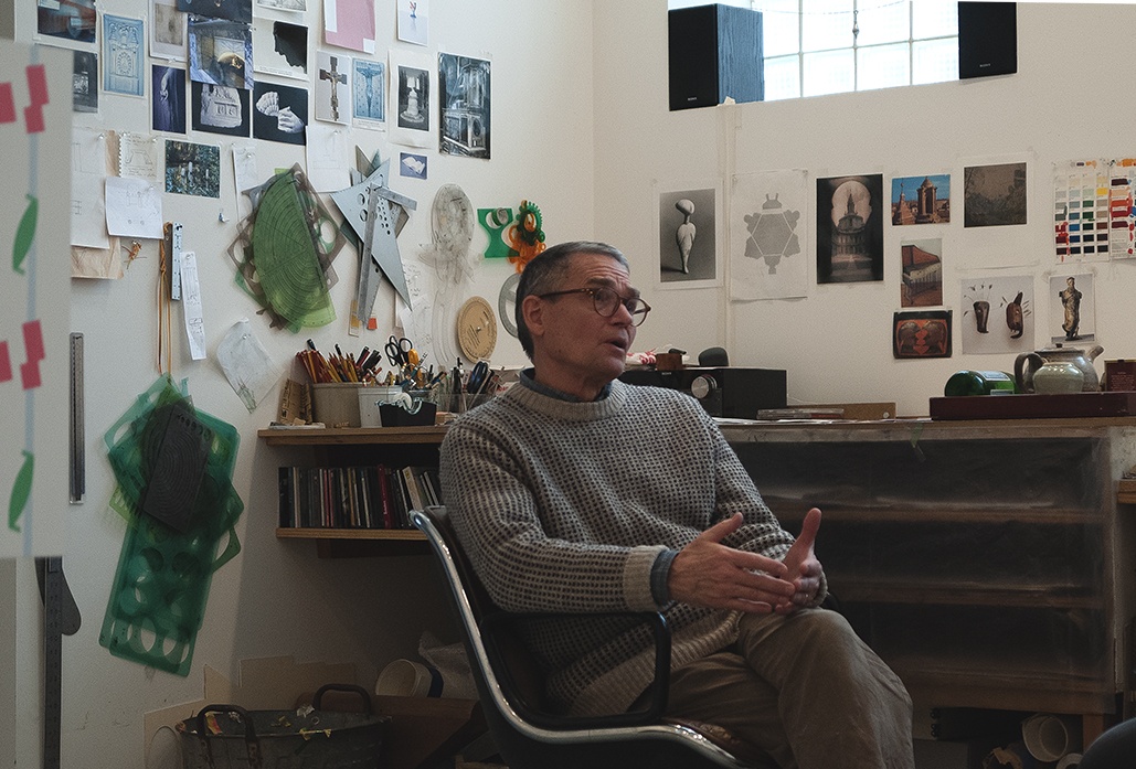
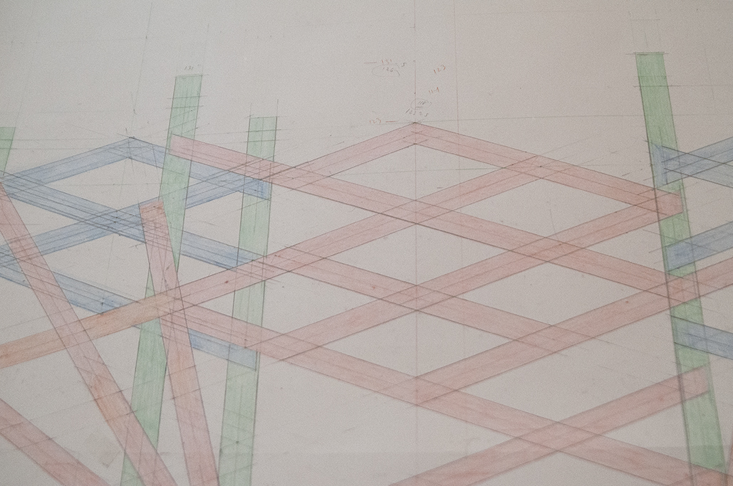
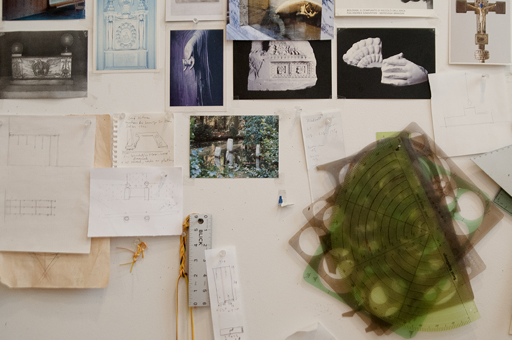
Before beginning any sculpture, Richard first draws. Through this act ideas manifest on paper— blueprints which are then altered and refined in a series of proceeding drafts. His mark-making is careful but never precious, as the drawings are first and foremost a vehicle for his abstract sculpture. Considering a work’s physical form follows these drafted musings, with Richard often building his sculptures in a way that will best express the honest and inherent details of their material composition.
I\W: Do you consider your preliminary drawings 1:1 blueprints for the resulting sculptures?
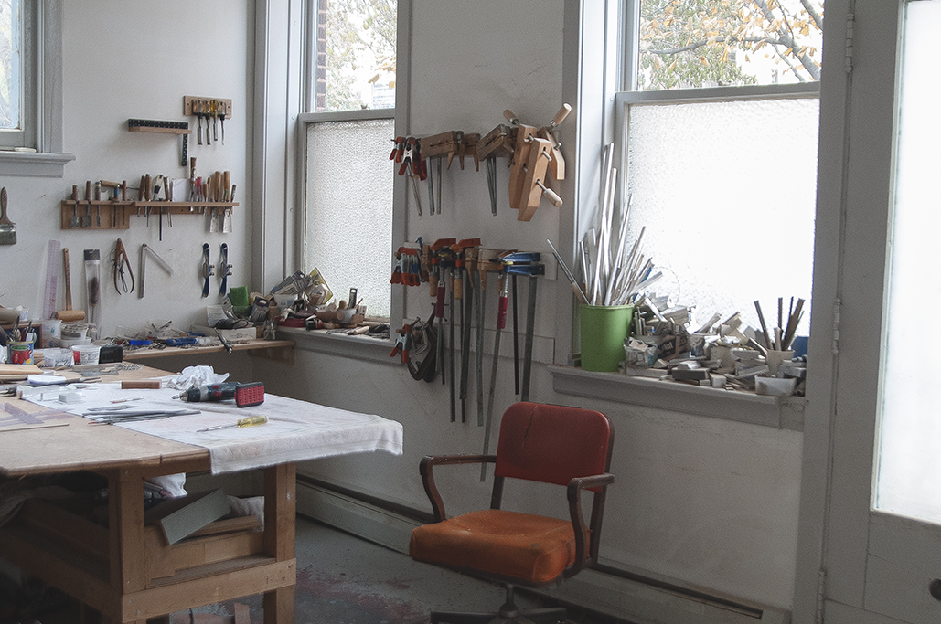
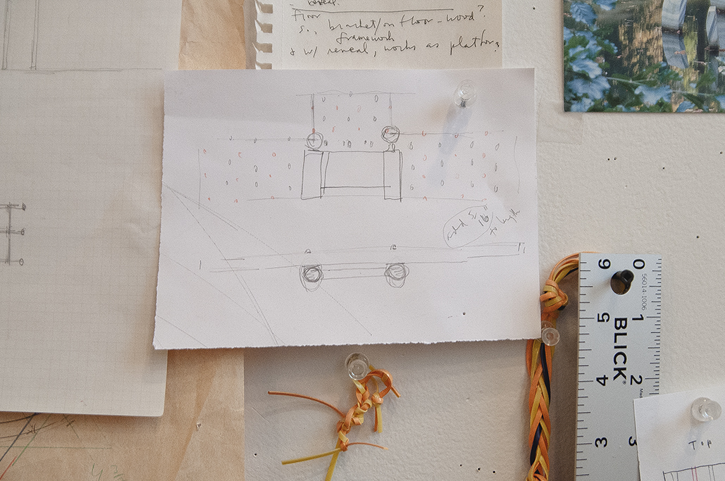
RR: I have always made drawings for sculpture. There is not a sculpture since the 1980s that has not had at least one drawing beforehand, and sometimes as many as three or four. Drawing is always the starting point for me. Especially in the past I really didn’t have much of an idea of what was going to happen from one work to the next, so drawing has always been an opportunity to search and find an idea. Often it begins very slowly, and then continues improvisationally by fits and starts. Usually the drawing goes through stages on one sheet where I record ideas that come to mind, and then on a larger sheet I plot it out more specifically with rulers and templates to make it more clear and to reach its appropriate size. Then, inevitably, that changes, there are alterations. When the sculpture is to be quite large, I still create a full-size rendering, but as a graphic visualization with tape or paper on the floor or wall.
How do you express depth in these drawings?
I rely on traditional architectural drawing — elevation and plan, with detail. And with those basic sections I can project, in my mind at least, the dimensions and relationship all around. I rarely have made rendered drawings or studies that a sculptor might have post-Renaissance, where the drawing looks like a representational image of the sculpture before it happens, or a ¾ view in space with perspective. Given that my sculptures are abstract, and largely geometric, the specifics of a graphic image gives me enough information, like an architect can imagine the impact of a facade or floor plan. The drawing, made as a 1:1 scale, provides a sense of the size that the sculpture will have as it resides on the floor or wall. This initial part is pretty straightforward and quite traditional.
How do you avoid viewing your drawings as master plans, or becoming too concerned with your mark making in the early stages?
Since the act of drawing begins the process towards a sculpture for me, I realized early on that the drawings could not become isolated or precious in themselves, and are not intended as independent works of art. After the fact, if I feel that a drawing is coherent and compelling, then I sometimes present it formally in an exhibition, but they really are just a vehicle on the way to making a sculpture.
Your work seems to effortlessly blend inspiration from architecture and interior design, mixing rough materials with smooth finishes. Is your intention for your work to have this balance?
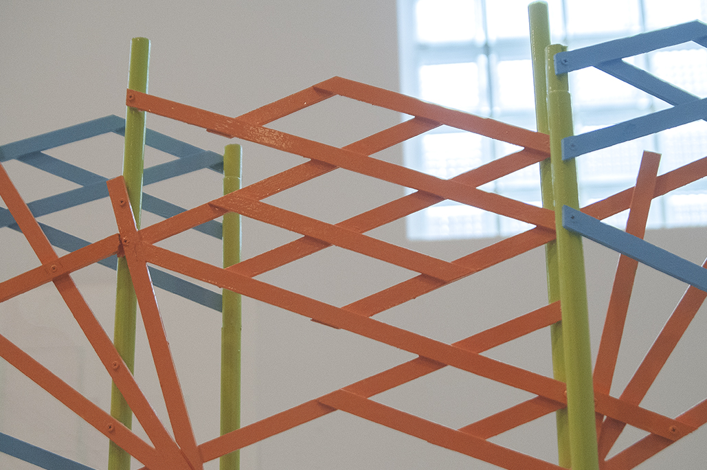
It is only after the drawing is completed, or nearly so, that I pose to myself questions of materials, exact size, and if the work will be wall-mounted, placed on the floor, or even be suspended. I do leave the possibility of materials open for quite awhile, and with that the process used to make each sculpture. In many ways the drawing tells me what is needed. It is true that recently there has been greater contrast between a rough surface and a more refined one, in combination. That is a result, generally, from my sculpture becoming more complex, having more parts, maybe even more materials. But it is in the nature of some materials like cast bronze and aluminum, and some kinds of wood, if left unpainted, to convey a degree of rawness compared to a smooth painted surface or polished bronze, for instance. If juxtaposed, those contrasts and differences react to each other. I’ve always valued a certain ‘truth to materials’ and inherent in that principle is leaving the material alone, if at all possible. Essential to me in this decision-making process is what the object means, and so its form and surface need to be integrated for that to be understood.
How do you avoid your work becoming too complex when you scale up in larger sculptures, or even public installation?
No matter what the size of the sculpture, I don’t see a fundamental difference in its complexity, or relative simplicity. My interest is in striking a balance that allows the viewer to experience internal complication and suggestion, but also being able to comprehend the complete sculpture at once. One advantage to the size of the studio work that I make is that a viewer is able to actually see it whole, as in easel painting size, edge to edge. This encourages close looking and makes the experience more intimate. And consequently, detail and the surface of the material contributes to the whole.
I’ve always valued a certain ‘truth to materials’ and inherent in that principle is leaving the material alone, if at all possible.
At what stage of your process does the inclination to have a sculpture mounted on the wall, suspended, or placed on the ground appear?
When the drawing begins, I don’t have a preconception about where it might be placed when finished. I try to leave myself as open and free as possible to the choices that develop while drawing. Then the form itself—its nature and degree of simplicity or complexity determines its position. In a wall mounted sculpture, the vertical and horizontal axis is an important, orienting factor. If that same object is on the floor, there is much less reason to regard its horizontal or vertical axis because as we circumnavigate a work on the floor, a greater understanding comes by the sense of its position, weight, or our body’s relationship to it. And as most of my sculpture is relatively small, if you are looking down at it, that is not so different than looking straight across at a sculpture on the wall, or for that matter, a sculpture that is suspended near the ceiling. So point of view becomes important, and that is another subtle distinction for me when I think about where a sculpture might belong.
Do you consider site-specificity in your exhibitions? Specifically, how are you considering the installation for your upcoming exhibition Address at The Renaissance Society?
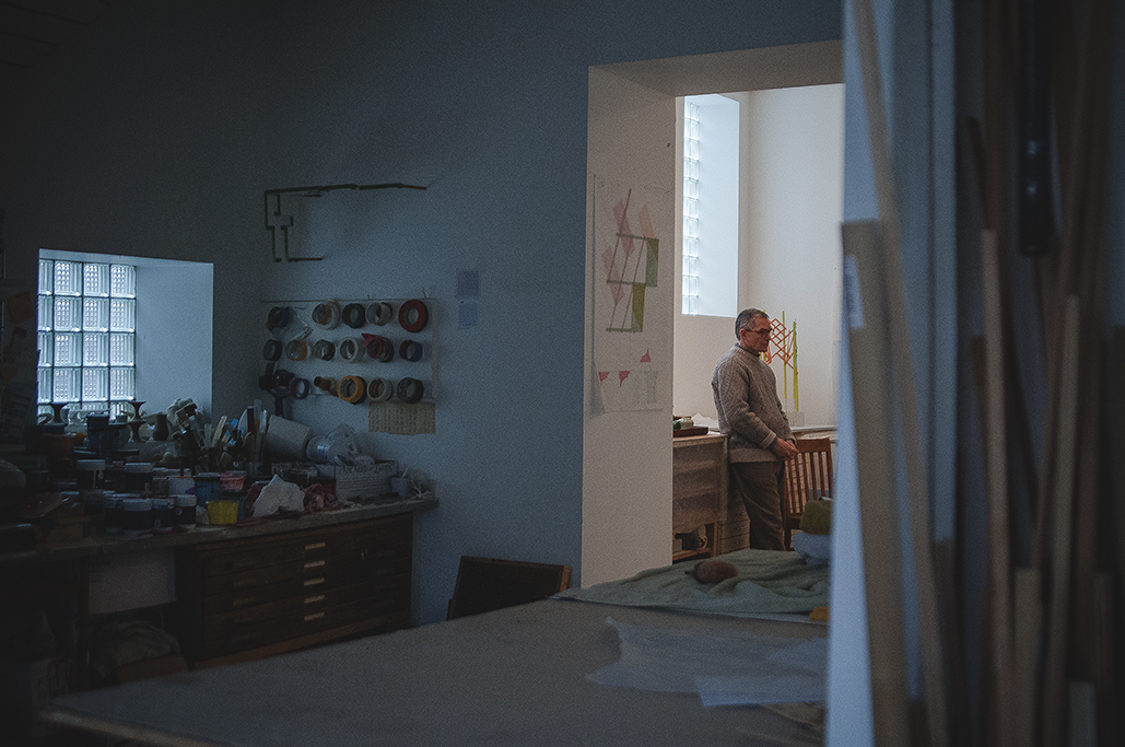
The Renaissance Society exhibition is a unique situation because the architecture is so specific — simultaneously institutional and domestic in scale, and in many ways challenging. The ceilings are especially high and the natural light defines that space for me. I have a few works that address certain areas in that gallery, and the installation of sculptures to be included is something I’ve had in mind for some time. In general, however, I do not think that far ahead about any one work, or how it will operate in one particular space.
How are you planning to bring older and newer works together in this upcoming exhibition?
There will likely be twenty sculptures. Most are from the last few years, and then three others are from the previous ten or twelve years. The older works were very specifically chosen. Within this, I have made an elevated screen as a room divider—placed on axis to capture natural light and to hold one previous work. I hesitate to call this divider a sculpture, as it has an architectural function. It is divided into different parts or sections, a composite of sorts, but these are subservient to the whole. This screen will correspond to another built wall in the gallery, also holding a few wall sculptures, but still allowing the entire space to feel open and light.
How else will recent and older works compliment and contrast each other in both the exhibition and physical space at the Ren?
The majority of works to be shown are quite new, and in my mind, have a basic difference one to the next, though their language and use of material and color have connections. The older works are understood as precursors, or seen as especially supportive of the newer sculptures in their presence and placement. So, as in most exhibitions that I have had, I want there to be a balance among the overall differences, a broad conversation, and how the individual works are placed within that unusual space of the Ren will hopefully fulfill that intention.


