Inside\Within is a constantly updating web archive devoted to physically exploring the creative spaces of Chicago's emerging and established artists.
Support for this project was provided by The Propeller Fund, a joint administrated grant from Threewalls and Gallery 400 at The University of Illinois at Chicago.

Search using the field below:
Or display posts from these tags:
3D printing 3D scanning 65 Grand 7/3 Split 8550 Ohio 96 ACRES A+D Gallery ACRE animation Art Institute of Chicago Arts Incubator Arts of Life audio blogging Brain Frame CAKE Carrie Secrist Gallery casting ceramics Chicago Artist Writers Chicago Artists Coalition Chicago Cultural Center Cleve Carney Art Gallery Clutch Gallery Cobalt Studio Coco River Fudge Street collage collection Columbia College Chicago Comfort Station comics conceptual art Contemporary Art Daily Corbett vs. Dempsey Creative Capital DCASE DePaul University design Devening Projects digital art Dock 6 Document drawing Duke University dye Elmhurst Art Museum EXPO Chicago Faber&Faber fashion fiber Field Museum film found objects GIF Graham Foundation graphic design Harold Washington College Hatch Hyde Park Art Center illustration Image File Press Imagists Important Projects ink installation International Museum of Surgical Science Iran Jane-Addams Hull House Museum jewelry Joan Flasch Artist's Book Collection Johalla Projects Julius Caesar Kavi Gupta Links Hall Lloyd Dobler LVL3 Mana Contemporary metalwork Millennium Park Minneapolis College of Art and Design Monique Meloche Museum of Contemporary Art Chicago (MCA) Museum of Contemporary Art Detroit (MOCAD) Museum of Contemporary Photography (MoCP) National Museum of Mexican Art (NMMA) National Resources Defense Council New Capital Northeastern Illinois University Northwestern University Ox-Bow painting paper mache Peanut Gallery peformance Peregrine Program performance photography PLHK poetry portraiture printmaking public art Public Collectors publications Renaissance Society risograph rituals Roman Susan Roots&Culture SAIC screen printing sculpture Sector 2337 Shane Campbell Silver Galleon Press Skowhegan Slow Smart Museum Soberscove Press social practice South of the Tracks Storefront SUB-MISSION Tan n' Loose Temporary Services Terrain Terrain Biennial text-based textile textiles The Banff Centre The Bindery Projects The Cultural Center The Franklin The Hills The Luminary The Packing Plant The Poetry Foundation The Poor Farm The School of the Art Institute of Chicago (SAIC) Threewalls Tracers Trinity College Trubble Club University of Chicago University of Illinois at Chicago (UIC) University of South Florida at Tampa Valerie Carberry Vermont Studio Center video weaving Western Exhibitions wood carving woodwork Yellow Book Yollocalli Arts Reach zinesInside\Within is produced in Chicago, IL.
Get in touch:
contactinsidewithin@gmail.com
Chad Kouri's Unique Multiples
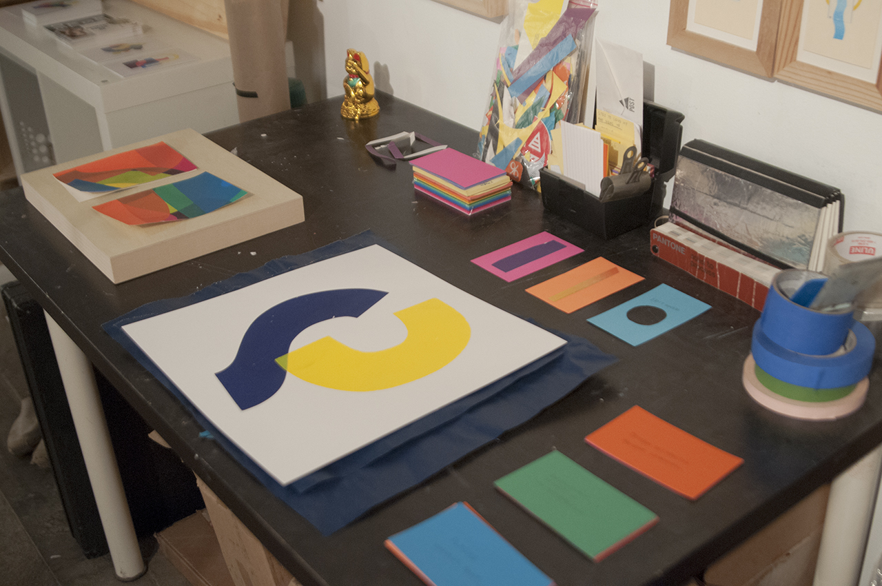
Chad’s studio shares the same space as The Post Family, a studio he co-founded that encompasses projects ranging from curatorial to woodworking. His personal practice is one that has stemmed out of his design background, collages imitating the same principals as jazz. Chad’s process involves carefully selecting the right composition of specified shapes and colors, rearranging their display over and over to create simple, yet eye-catching arrangements.
I\W: Could you explain the project you did titled “Whitney Biennial Arbitrary Critiques” and how it ties into your ongoing series “Art Advice?”
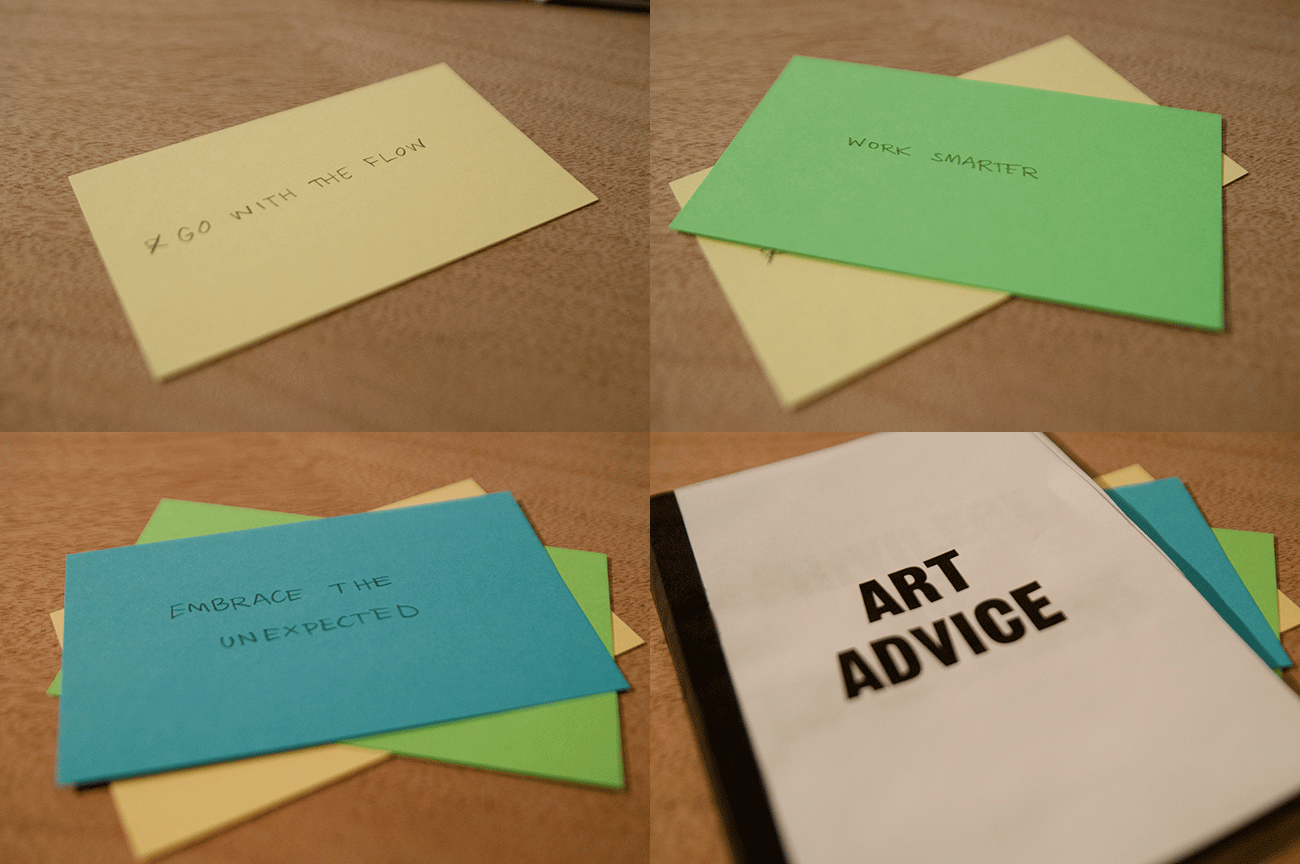
CK: The idea was to visit the Whitney Biennial during opening weekend, be a fly on the wall, and listen to how people were reacting to the artwork in the show. I didn’t know who the people were, what their educational background was, or what their relationship was to the show at all. I decided to take these tidbits and create an editioned box set of text-based prints. The Art Advice stuff is very similar, just pulling little nuggets from different lecture series, artist talks, and gallery openings. One of my goals while working with arts organizations and even with my own art practice is to give the viewer a bit more context—and credit—so there is an easier entry point into having a conversation with the work, exhibition, or organization. Especially with my fine art work being hard edge minimal abstraction, there is typically a very knee jerk reaction of “I could do that,” or “What makes these shapes any more special than any other shapes?” I am trying to give the viewer a wider point of entry into the work or experience so that they feel a little more comfortable talking about it and speaking up.
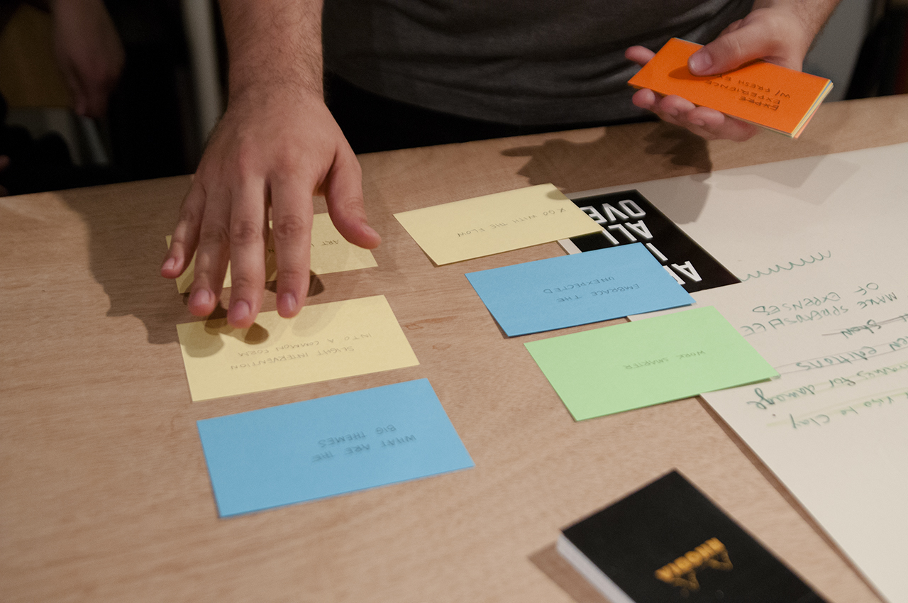
How are you disseminating the tidbits you collect for Art Advice?
It’s kind of a mix of things. They are text-based pieces and typically start as index cards. I carry index cards all the time, constantly writing things down. Some of the overheard tidbits get made into posters or postcards. I don’t hold any copyright to any of this stuff. I didn’t say it, so I don’t really feel like it is appropriate to sign any of the editions that come out of it. For example, Claire Molek of Brave New Art World did an artist lecture where she wanted to use one of the posters (with text reading “THIS WEIRD GRAY AREA”) and she asked if she could buy it in order to reproduce it. I just gave her the PDF and told her to go to Kinko’s and print off as many as she wanted. I’m not really that worried about having ownership over these works. They are suppose to exist out of the ether, with no origin or ownership so I feel comfortable sharing them with anyone who asks.
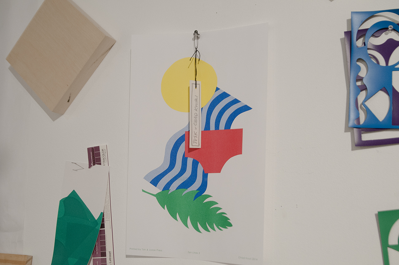
Have the risographs you created for Tan & Loose inspired you to want to work more with risograph prints? What is your process for your other prints?
Yeah, I am doing quite a few risograph editions for my solo exhibition at Johalla Projects. Specifically I’m working with 5×7 to produce the exhibition graphic as a risograph print, I’m doing a catalogue that will have a short interview and some risograph compositions, as well as some full color photos of the exhibition. Tan & Loose is also publishing one of my Jazz Movement Study drawings for the show. I’ve done printmaking and collage for awhile now and they were always very separate practices. About 16 or 18 months ago I started doing screen printing as a bottom layer for my cut paper collages—which I’ve more recently been calling “paper paintings.” I’m cutting stencils out of paper to be screen printed so it still stays within in that same cut paper language that I’ve used for a while. Basically when you are screen printing with paper stencils, you destroy the stencil when you are printing it so there isn’t an opportunity to do a whole bunch of them. After I have a good stack of pieces with two or three screen printed shapes on each, I can then edit them down and add layers of paper to the pieces that I think are working best, compositionally. Some prints have kiss marks or didn’t print perfectly, and those imperfections dictate the composition most of the time. If I like one part of the print but another is off, I need to cover that section with paper. I’m not one to work on a certain piece from start to finish over a long period of time. I do a big group of work in phases and slowly edit down over time. It’s like chunking the process down to doing all the screen printing first, then all the cut paper next. In the end, I find the small handful of printed pieces that are working well, I add the cut paper to them, edit down again, and then they are all finished simultaneously.
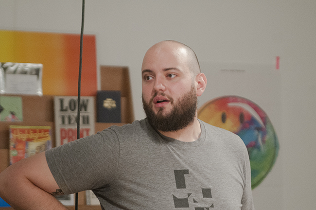
How did you transition your design practice into incorporating fine art?
I was a designer first. I have been doing design work since I was 15 and I always wanted to be a designer. I never thought I would be excited by artwork until I realized I had to be on my computer for 16 hours a day in order to make a living as a designer. I started doing collage work as a way to get off the screen and over time began giving them away to friends. Soon it became really hard to give stuff away because it felt like all the handmade work was really precious, so I started making work that was specifically made to be given away. That helped me get more comfortable with letting go of the work and start to price stuff. For me, it’s all about constantly figuring out ways of brainwashing myself into being comfortable with a new process.
There is a certain level of playfulness and simplicity to the shapes I use. They can’t be too complex. I have a toolbox of shapes and colors that I can keep going back to over and over again—taking away and adding to it over time. After a while, it just becomes impulsive. They almost build themselves.
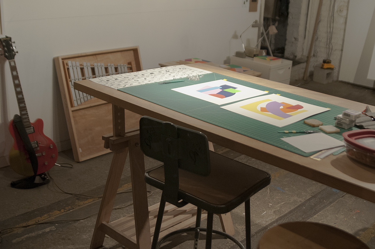
How has your collage work developed since you have been making it? Your early work seemed to incorporate many more found images and detail.
Yes, it started with a lot more appropriated imagery. Lots of images from old advertisements because I was working in design and advertising and that stuff had great typography and imagery, and it was very familiar and comfortable to me. I would be taking old ads—mostly stuff from the ’50s and ’60s—and chopping them up, trying to juxtapose two different things to give a bit of tension or irony to the work. For example, I had this series of babies and cigarette collages—just juxtaposing two random things that would never show up together in print, but were printed in a similar way and once they were pasted together, kind of looked like they belong together. But over time people started to become interested in buying more work so I knew the materials I was using needed to be more archival. That—and wanting the work to translate into different mediums like sculpture and editions a bit more seamlessly—influenced the switch from appropriated imagery to simple shape and color compositions.
I studied jazz for a while and I constantly draw lines between being a jazz musician and my practice. The idea that when you are a jazz musician, your first task is to learn your scales, various progressions and standard melodies. Later—when asked to improvise—you take all those pieces, chop them up and make something new out of them. That is very much how I see my design practice. You have typefaces that exist, you have color theory, you have images that are supplied by clients—amongst other things—and it’s your job to make something new out of all this older stuff. My art practice is the same way. Every grouping of cut paper works I create, I have a fairly rigid color scheme that I am working with. Especially with the screen printing aspect. There is a certain level of playfulness and simplicity to the shapes I use. They can’t be too complex. I have a toolbox of shapes and colors that I can keep going back to over and over again—taking away and adding to it over time. After a while, it just becomes impulsive. They almost build themselves.
With the micro projects that you do with #photosthatshouldbepaintings and #gridsinreallife, is that your way of having some sort of organization in your life within the multiple tracks of your work?
I’m super obsessed with collecting things, especially paper. I have finally gotten to the point where I can’t keep collecting physical things. If I can’t find a specific reason to use this thing, then I shouldn’t bring it home because I just have too much shit. But I can take as many pictures on my cellphone as I want. It is another way of tricking myself. I am still collecting things, they are just not physical, so they don’t take up the space. A lot of those photos are things that I have been taking for years as composition references for collages, or references for design work. It’s another entry point into my work for the viewer. It’s another way of tricking myself into not holding things too tightly. The #photosthatshouldbepaintings and #gridsinreallife hashtags on Instagram now have people from all over the world using those tags, which is awesome. It’s also another way to get people involved in a part of my practice and feel like they can relate to it and be a part of it.
