Inside\Within is a constantly updating web archive devoted to physically exploring the creative spaces of Chicago's emerging and established artists.
Support for this project was provided by The Propeller Fund, a joint administrated grant from Threewalls and Gallery 400 at The University of Illinois at Chicago.

Search using the field below:
Or display posts from these tags:
3D printing 3D scanning 65 Grand 7/3 Split 8550 Ohio 96 ACRES A+D Gallery ACRE animation Art Institute of Chicago Arts Incubator Arts of Life audio blogging Brain Frame CAKE Carrie Secrist Gallery casting ceramics Chicago Artist Writers Chicago Artists Coalition Chicago Cultural Center Cleve Carney Art Gallery Clutch Gallery Cobalt Studio Coco River Fudge Street collage collection Columbia College Chicago Comfort Station comics conceptual art Contemporary Art Daily Corbett vs. Dempsey Creative Capital DCASE DePaul University design Devening Projects digital art Dock 6 Document drawing Duke University dye Elmhurst Art Museum EXPO Chicago Faber&Faber fashion fiber Field Museum film found objects GIF Graham Foundation graphic design Harold Washington College Hatch Hyde Park Art Center illustration Image File Press Imagists Important Projects ink installation International Museum of Surgical Science Iran Jane-Addams Hull House Museum jewelry Joan Flasch Artist's Book Collection Johalla Projects Julius Caesar Kavi Gupta Links Hall Lloyd Dobler LVL3 Mana Contemporary metalwork Millennium Park Minneapolis College of Art and Design Monique Meloche Museum of Contemporary Art Chicago (MCA) Museum of Contemporary Art Detroit (MOCAD) Museum of Contemporary Photography (MoCP) National Museum of Mexican Art (NMMA) National Resources Defense Council New Capital Northeastern Illinois University Northwestern University Ox-Bow painting paper mache Peanut Gallery peformance Peregrine Program performance photography PLHK poetry portraiture printmaking public art Public Collectors publications Renaissance Society risograph rituals Roman Susan Roots&Culture SAIC screen printing sculpture Sector 2337 Shane Campbell Silver Galleon Press Skowhegan Slow Smart Museum Soberscove Press social practice South of the Tracks Storefront SUB-MISSION Tan n' Loose Temporary Services Terrain Terrain Biennial text-based textile textiles The Banff Centre The Bindery Projects The Cultural Center The Franklin The Hills The Luminary The Packing Plant The Poetry Foundation The Poor Farm The School of the Art Institute of Chicago (SAIC) Threewalls Tracers Trinity College Trubble Club University of Chicago University of Illinois at Chicago (UIC) University of South Florida at Tampa Valerie Carberry Vermont Studio Center video weaving Western Exhibitions wood carving woodwork Yellow Book Yollocalli Arts Reach zinesInside\Within is produced in Chicago, IL.
Get in touch:
contactinsidewithin@gmail.com
Dan Gunn's Implied Mobility
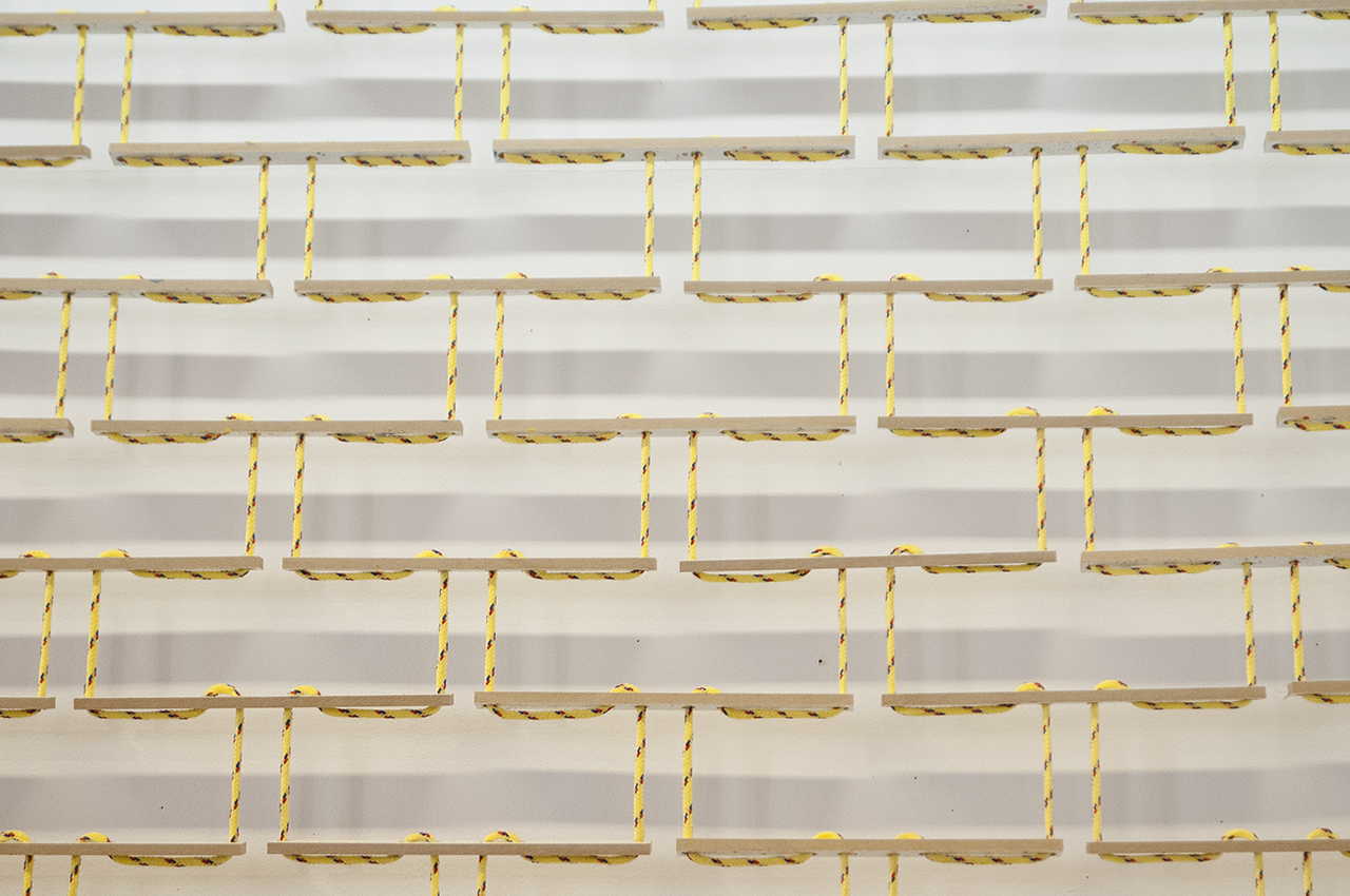
Stitching together wooden slats inspired by photographed fabric, Dan creates mobile sculptures—objects that stray from their material’s restrictions. Through Photoshop Dan manipulates his sources, accepting the computer-aided gestures and errors that produce another dimension for his photographic sculptures.
I\W: What are the origins of the wooden fabric pieces you have been building recently?
DG: That is one of the recent series along with the fans. I had made some smaller examples out of laser cut plexiglass for works that hung in the windows. The light went through the various layers and created shadows for the pleats. The idea for the plexi-window piece came to me pretty much intact. It took longer for me to move into making them out of wood. The first step is usually setting up some fabric in my studio, followed by photographing them and playing more in Photoshop. There is an in-between stage where they get weirder, the folds get flattened and stretched, but they still have a bit of a picture quality. The fabric never was physically quite like it gets represented later in the final work.
Do you intend to have a similar movement in your pieces to the fabric they’re inspired by?
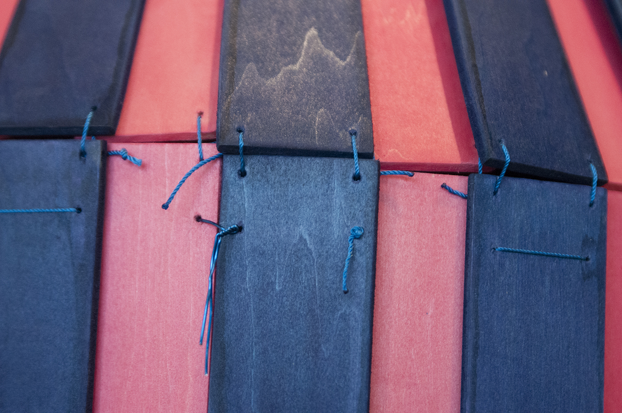
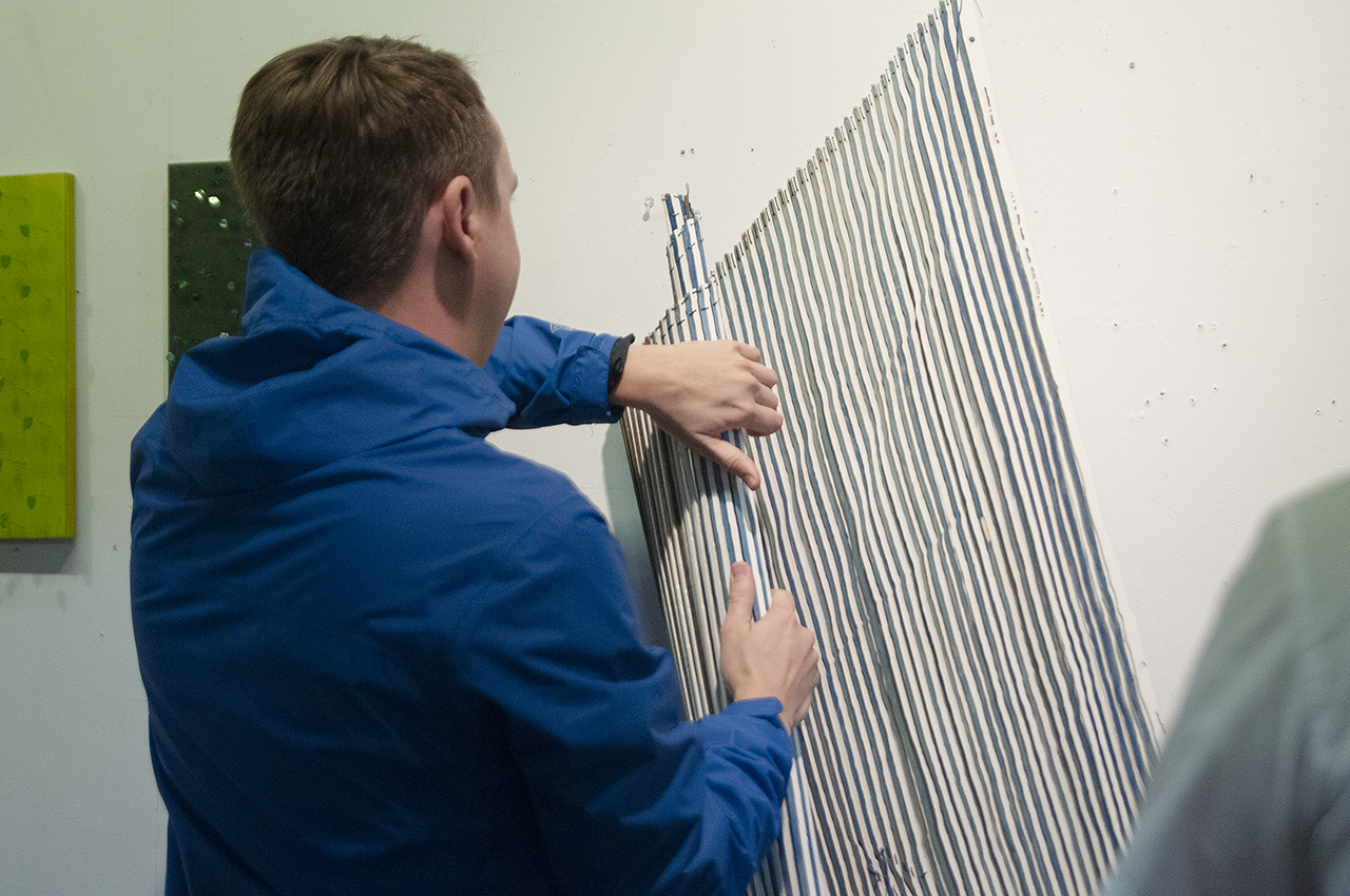
I like to think of them as a third thing. They are made of rigid wood strips but laced back together with string. They are flexible in some respects, but not in others. I can frequently roll them up or fold them. They are both a picture and a separate object, but they also have their own hybrid characteristics too. I have one piece that starts to bow out and splay on the wall because of how gravity affects it differently than it did in the fabric image that it was derived from. They have this kind of a tricky motion. I think that is why I am interested in them and why the folding makes sense from the drapery image. It relates to the way they end up being in the world. I think the picture is still important, that is an object trying to be a picture of something. If I were to just take fabric and put it on the wall in an arrangement, I don’t think it would have a kind of distance, I guess I’m thinking of reference as distance. I’m interested in the boundaries of the picture experience.
Will you explain the process behind creating your fan pieces?
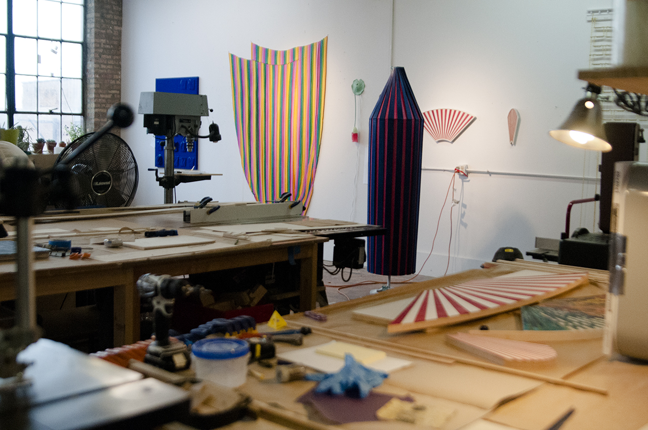
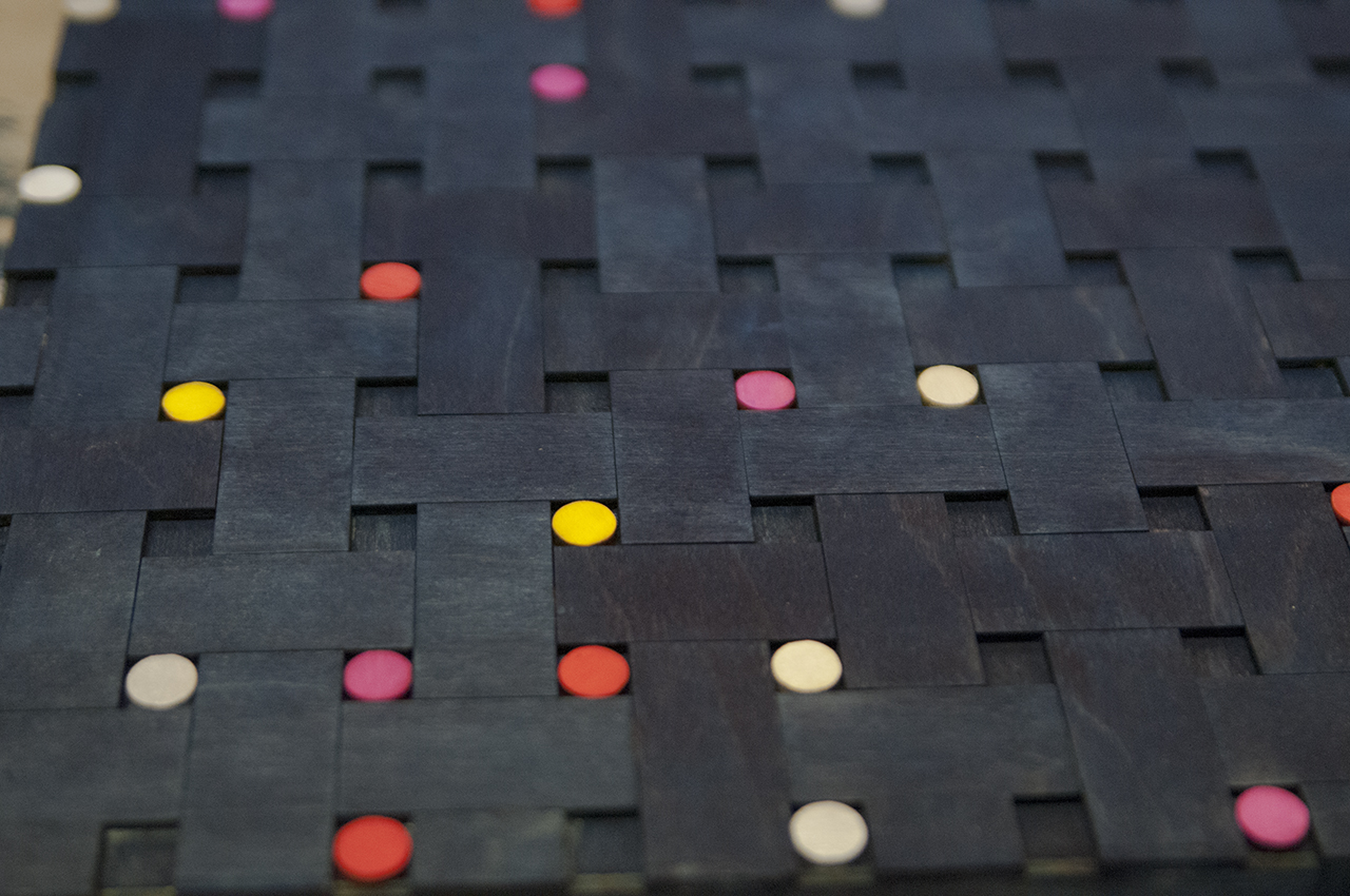
The original one was created from a series of offcuts from another project accidentally placed together. There was something about the shape that I liked immediately, it implied a kind of movement and allowed for a lot of permutations and had a history as an image type. Plus I thought it was hilarious to have a kind of small-scale shaped painting / wood inlay trinket. There was always something so macho about those ’70s minimalist painters like Mangold and Stella that made tiny versions quite appealing. Now the individual pieces are all cut out on a laser-cutter based on a file, stained separately, and recombined in a kind of ad-hoc inlay process.
There are sort of two different kinds of fans at the moment. There are a series of red and white ones that I am being a little more deliberate with. I had this fan shape that implied a possibility of movement and I thought ‘Why don’t I just close them?.’ I went to go do that in Illustrator and of course it just squished the image on the x-axis! A “real” fan should close and all the sections should line up vertically, but here they all just got skinnier. I think there is something so funny about the inarticulateness of that “computer-aided” gesture, that it was just a spatial rearrangement on Illustrator. I find something very charming about that. That’s sort of one mode, and I can see them getting even more strangely twisted and loopy but have the same sort of red and white repeat so you can maintain the same anchor.
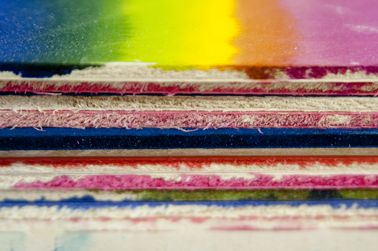
With the other ones I usually just stain a bunch of segments in bulk. I just sit listening to an audiobook, staining them all, then start arranging them. It is fun for me because it makes it a little bit more playful. People ask me about my color choices and all I can say is that I try not to think about it too hard. That I just make enough options so that I can recognize a surprise combo when I stumble across it. It’s not interesting when the process is so preordained.
What is with your recent interest in carnivals?
I have been thinking a lot more about the carnival and zaniness in general. I am going to teach a class at Ox-Bow with Karolina Gnatowski on this book by Sianne Ngai. She wrote a wonderful book about the cute, the zany, and the interesting as contemporary aesthetic terms. The zany is where I identify the most at the moment. It’s the kind of the Lucille Ball effect, where you’re trying to keep all of the balls in the air, juggle all of the different tasks, but never are quite successful. It’s the affect of the worker of temporary odd jobs. I think part of the reason that my work has tended to locate itself in forms that imply movement, pieces with a lot of parts, things that are temporary and can be set up in multiple ways, is because of this feeling that the aesthetic object has a multitude of jobs.
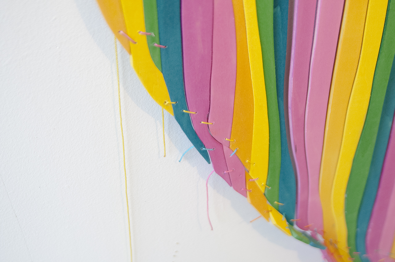
For instance I created a piece that has the same sort of articulation as a tent awning, the curvature is created by the stitching in combination with the layering. It is based on this porch awning that I had seen above someone’s door in Indiana made out of tin. It had this ruffled, layered look to it. I elongated it down to the ground and made it 360 degrees. What if it was a tent for one, or a dress form of some kind? I made an earlier one that was just a quarter circle that fit into a corner. It was more attached to the architecture, so I wanted to try and bring this one out into the space a little bit more. I like temporary forms of architecture or reconfigurable furniture. I’ve made a couple of series of screens, shown them open and closed and made a scrunched up dinner table called “Patchwork Plateau” for the MCA. That is part of the tent fascination, having this implied mobility and actual reconfigurability.
If I were to just take fabric and put it on the wall in an arrangement, I don’t think it would have a kind of distance, I guess I’m thinking of reference as distance. I’m interested in the boundaries of the picture experience.
Does the carnival inspiration also come from your interest in staging and past work with building sets?
I had a really great job at Lookingglass Theatre Company after grad school. I was just a grunt building these stages. I enjoyed the experience to see a stage up close. They are so fake looking! We would always build them in parts in the workshop, then load them up in the truck, drive them over to the theatre, and bolt them back together. They were unconvincing up close but when you sat down in the audience, with the actors going and the lighting set, the picture resolved itself. There is something pretty deep about that fake picture transforming itself into something believable. That is the kind of artworks that I find myself drawn to. Things that have a dual life.
How does that contextual believability find its way into your work? Do you think there is a context that your pieces don’t work so well in, and some that they do?
I think the art gallery is the context that the work is aimed at. I’ve always thought a lot about Daniel Buren’s “Watch the Doors Please” from 1980, a project that he did at the Art Institute with the Metra. There is a section of windows in the museum where you can see the trains pass underneath the galleries. He painted vertical stripes on the doors of the trains and then posted a train schedule inside of the museum. Viewers would stand inside the museum, reading the train schedule and waiting for the train to pass by the striped doors. Inside the museum you would see it as an artwork that had been placed onto the train, whereas everyone riding the train would see it as oddly painted train doors, and not think about it anymore. That’s why the art context is important I think. It’s just a form of heightened aesthetic attention.
Do you think there is one element that is consistent in all of the works that you make, or one idea that finds its way into each painting or sculpture?
I have trouble locating that sometimes. Sometimes it seems like it is motion—this idea of multiple things happening at once, or a coordinated effort by different pieces to do one thing. That’s a big part of it really, this cooperative effort between parts to make a picture. It also might be located in a biographical sense of being super Midwestern and kind of playful. The colors are usually bright, I have a hard time saying no to shiny materials and I collect vintage patterned fabrics. Something in the interplay between those trajectories.
Can you elaborate on playing with your pieces in photoshop?
There are so many possibilities in the exchange between the computer space and the physical space that I’m excited to explore. I’ve done a small amount of digital printing of repeat fabrics that will surely find their way back into the loop at some point.
Initially you studied physics. Would you say that this was something that has been a core tenant of your work, or is this something you have completely left out of your practice?
I don’t think that I have erased that way of thinking. I still proceed in a fairly linear fashion. Really it was a situation where doing things with physics is always breaking stuff apart and at a certain point it got a little too esoteric for me. I wanted to do something that I could use experimentally to investigate things that are more social. I think I got a little too much nature and needed some more culture.
