Inside\Within is a constantly updating web archive devoted to physically exploring the creative spaces of Chicago's emerging and established artists.
Support for this project was provided by The Propeller Fund, a joint administrated grant from Threewalls and Gallery 400 at The University of Illinois at Chicago.

Search using the field below:
Or display posts from these tags:
3D printing 3D scanning 65 Grand 7/3 Split 8550 Ohio 96 ACRES A+D Gallery ACRE animation Art Institute of Chicago Arts Incubator Arts of Life audio blogging Brain Frame CAKE Carrie Secrist Gallery casting ceramics Chicago Artist Writers Chicago Artists Coalition Chicago Cultural Center Cleve Carney Art Gallery Clutch Gallery Cobalt Studio Coco River Fudge Street collage collection Columbia College Chicago Comfort Station comics conceptual art Contemporary Art Daily Corbett vs. Dempsey Creative Capital DCASE DePaul University design Devening Projects digital art Dock 6 Document drawing Duke University dye Elmhurst Art Museum EXPO Chicago Faber&Faber fashion fiber Field Museum film found objects GIF Graham Foundation graphic design Harold Washington College Hatch Hyde Park Art Center illustration Image File Press Imagists Important Projects ink installation International Museum of Surgical Science Iran Jane-Addams Hull House Museum jewelry Joan Flasch Artist's Book Collection Johalla Projects Julius Caesar Kavi Gupta Links Hall Lloyd Dobler LVL3 Mana Contemporary metalwork Millennium Park Minneapolis College of Art and Design Monique Meloche Museum of Contemporary Art Chicago (MCA) Museum of Contemporary Art Detroit (MOCAD) Museum of Contemporary Photography (MoCP) National Museum of Mexican Art (NMMA) National Resources Defense Council New Capital Northeastern Illinois University Northwestern University Ox-Bow painting paper mache Peanut Gallery peformance Peregrine Program performance photography PLHK poetry portraiture printmaking public art Public Collectors publications Renaissance Society risograph rituals Roman Susan Roots&Culture SAIC screen printing sculpture Sector 2337 Shane Campbell Silver Galleon Press Skowhegan Slow Smart Museum Soberscove Press social practice South of the Tracks Storefront SUB-MISSION Tan n' Loose Temporary Services Terrain Terrain Biennial text-based textile textiles The Banff Centre The Bindery Projects The Cultural Center The Franklin The Hills The Luminary The Packing Plant The Poetry Foundation The Poor Farm The School of the Art Institute of Chicago (SAIC) Threewalls Tracers Trinity College Trubble Club University of Chicago University of Illinois at Chicago (UIC) University of South Florida at Tampa Valerie Carberry Vermont Studio Center video weaving Western Exhibitions wood carving woodwork Yellow Book Yollocalli Arts Reach zinesInside\Within is produced in Chicago, IL.
Get in touch:
contactinsidewithin@gmail.com
José Lerma's Neon Gestures
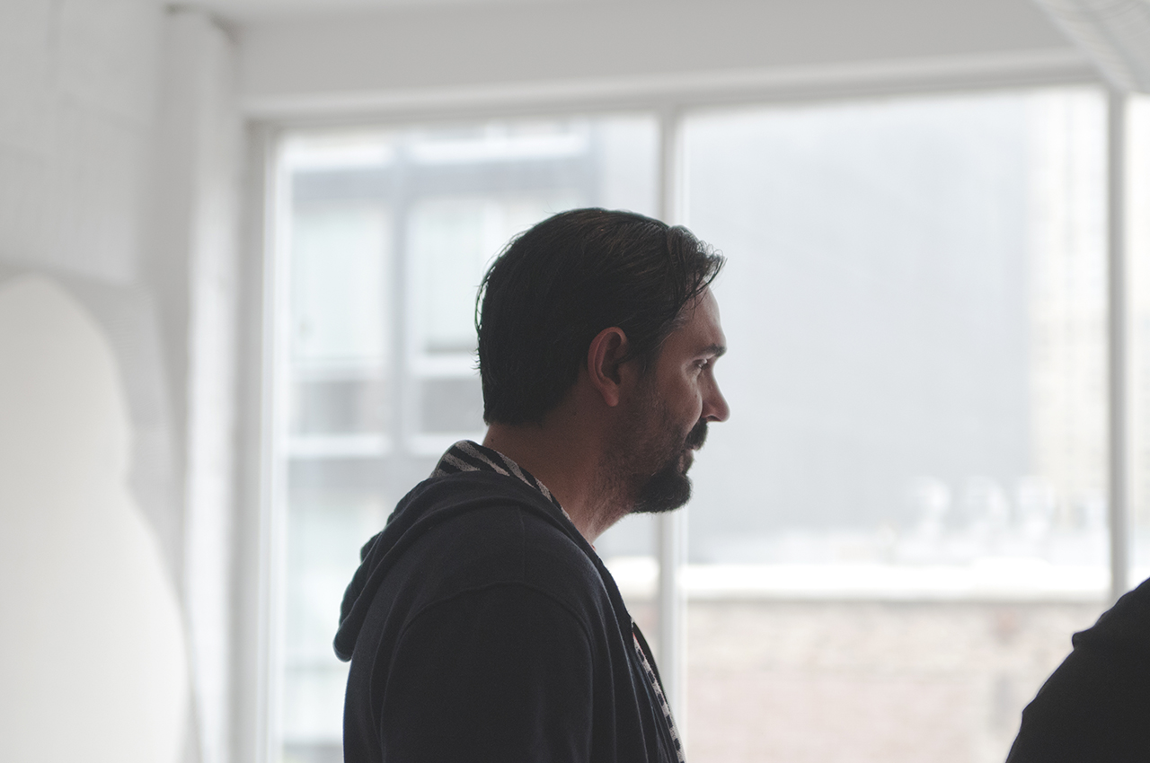
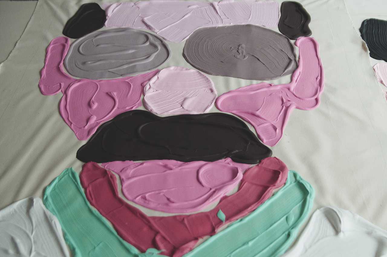
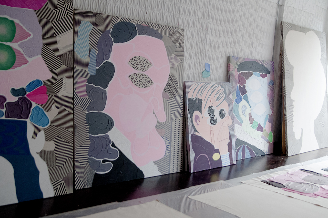
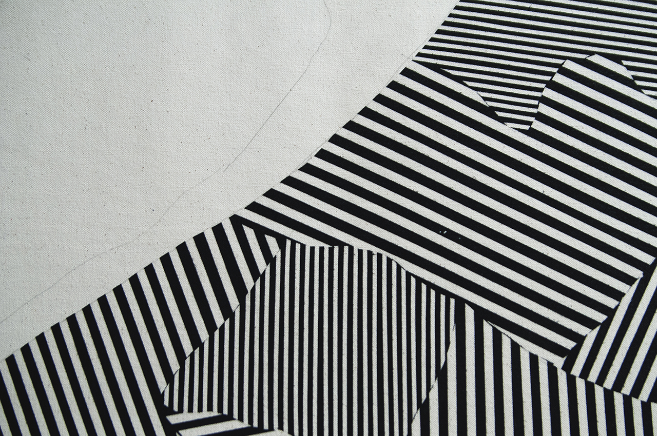
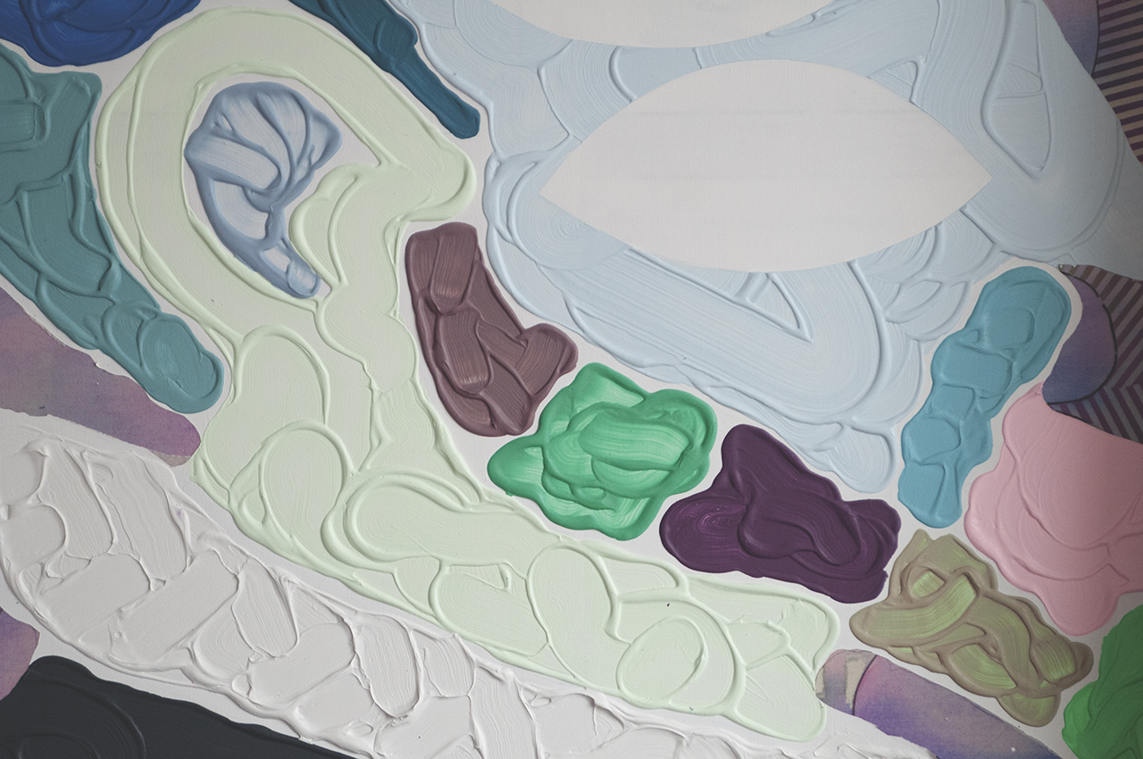
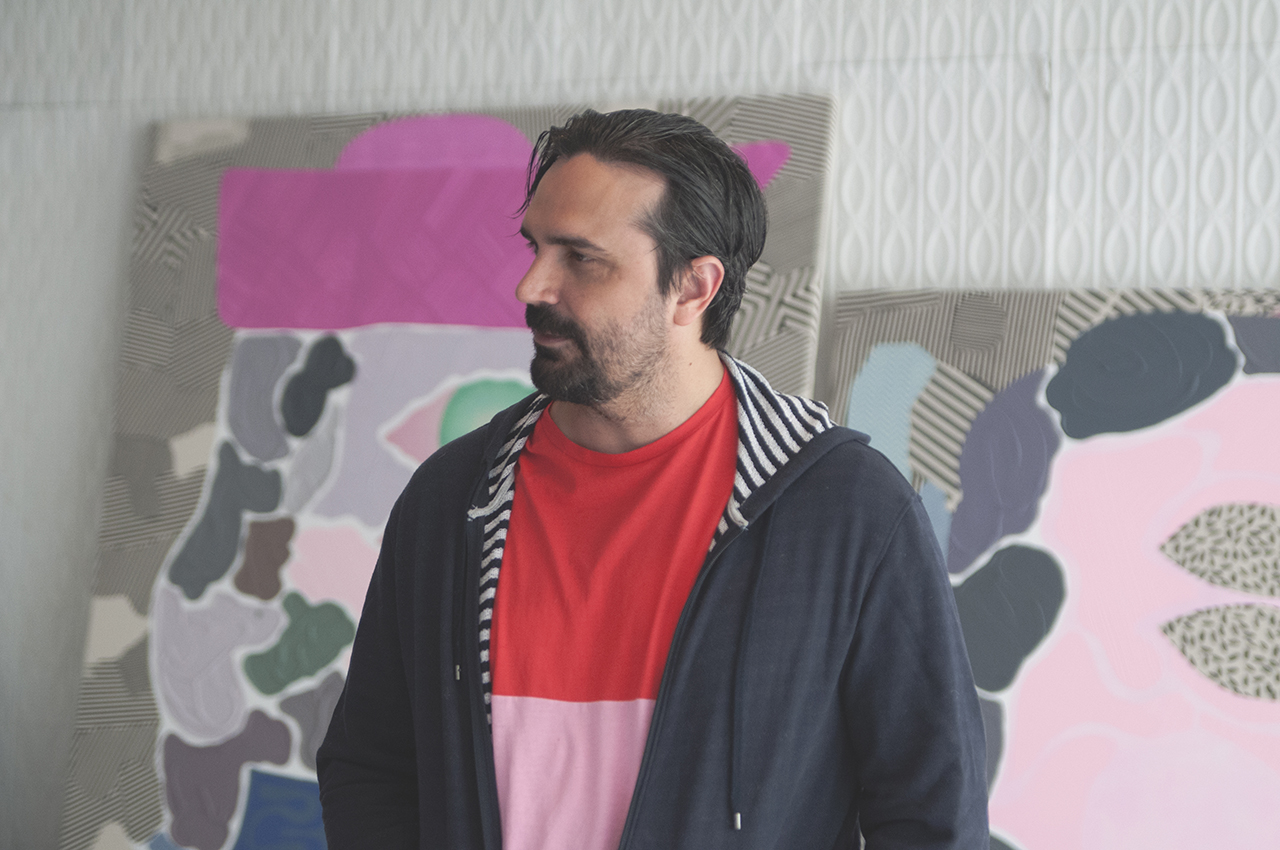
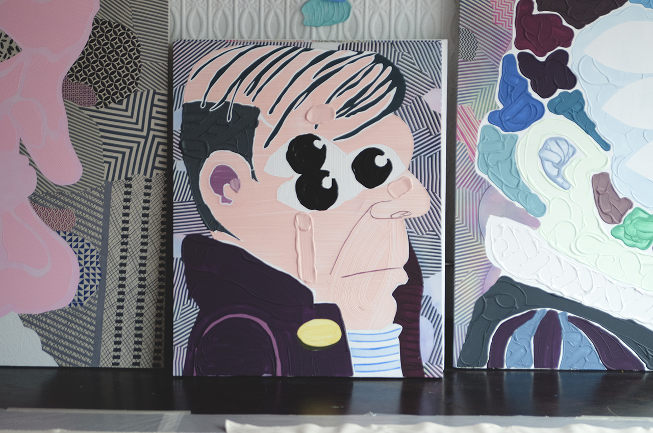
Lit with bright, white light from the floor to ceiling window at the front of his studio, José’s work is cast in an ethereal glow, bright pinks, purples, and blues converging to form the faces of bourgeois bankers and 17th century royalty. To create these large paintings José scales up his materials, using brooms to produce thick, sculptural paint strokes. His neon palette and tendency towards light-activated works serves as a distraction to his works’ content, forcing the audience to test their concentration while being bombarded with blinking lights.
I\W: What are the portrait subjects you are focusing on in your newest paintings?
JL: For the past three years I have been working on shows where I just make the paintings on-site and use whatever materials I can find. I haven’t done anything like studio work in a while, so recently I have been trying to get back into studio mode. I wanted to try going back to the paintings I was making in 2008 that I kind of abandoned. I have painted Charles II and his father recently as subjects. With every succeeding generation I paint the chins get bigger and more cartoonish. In order for them to retain power they had to inbreed, and as you inbreed your chin gets bigger and the possibilities for breeding again become fewer and fewer until you make the whole thing disappear—a kind of an implosion seen through genetics. I would like to display all of these portraits as a family, but right now I am just painting individual portraits instead of making work for a show based on a singular concept which is how I have typically operated. Usually I do some research, find some historical facts, and then start collecting materials that somehow deal with the subjects in terms of surfaces and pigments. The materials adapt themselves to the theme.
Why are you drawn to this vibrant neon palette that seems to permeate all of your paintings?
I’m not sure. I was doing a lot of pastel work from 2004-2007, and all the paintings were very very light. The whole idea was that they would have a very slow read for the audience. The colors would be adjusted slightly so the light would be bouncing from side to side. These paintings now only have three or four colors, so the work is able to be read really fast. The interpretation now is about the sculptural aspect of the brush and the thickness of the paint. By this point the color choices have become an affectation. I did do some shows that had very bright colors that would also interact with lights. That was important in that particular context because a lot of the subject matter I was doing was centered around banking or conquest—subjects that were not necessarily boring, but were very serious. I wanted the audience to feel themselves being distracted. That condition is something I am interested in—having a very dramatic distraction happening at the same time you are being given something serious. Your sort of forget what you are looking at and continue to stare at the painting’s colors.
Is that distractive element the reason behind several of your installations’ use of strobes, black lights and flash sensitive materials?
Some are, and others come from stories. The reflective curtains come from a story where my father set some curtains on fire when I was a kid and it was traumatic, so that light thing was a very important theme in my work. In my show at the MCA I used the curtains because each piece was a reference to one of the donors of the museum. Everything was as portrait of the plaque that was already in the room. The person whose plaque was in that particular room happened to have been an ophthalmologist and specialized in laser surgery for cataracts. I wanted to reference that by placing a very optical effect in the work.
A lot of your work pulls both from a collected history and your own personal history, why do you like to combine both of these subjects?
The history thing is just something I am interested in, at first I was just making work about stories from my life and then I hit a wall. There are only so many interesting things that you can say about yourself. I gravitated towards history because I was reading biographies anyway and watching a lot of documentaries. I thought why don’t I just use this, I do this anyway. It seemed like an easy decision. Then I knew I needed to blend the elements and try to create a third thing— a third meaning. Place honest reaction and honest interest together and use it as a machine to create aesthetics. It is not as mechanical as that, but it is a great thing to go back to when you are stuck. By now some of the stories reveal themselves in later forms. At some point it just becomes ingrained into my aesthetic. It solidifies as a form I use, but it has a very honest beginning. The carpets for example come from really specific stories.
What specific stories, and how did you begin to incorporate them into your installations?
The story is from my childhood. Both my parents were working one day and I decided to take some paint and use it on all of the furniture as well as the carpet. I thought I was doing this great thing and they would be really impressed. However when they came back home I said, ‘Ta da!’ and revealed it to them my mom was obviously extremely angry. But I had no idea! I remembered that story and was trying to think what I could do with it. In 2007 I was using that retroreflective fabric and I had a show in Berlin where I was going to show some paintings I had made with it. When I got there however there was a German guy that had done some retroreflective paintings in the gallery next door! It was only a month until my show, but I knew I had to come up with something else. That fabric is cool but it is too seductive. It is too easy. I was looking at carpets in Berlin and they have all of these great colors. Then the tourist thing kicks in. If you are in Home Depot, everything is beige, if you are in Berlin everything is orange and bright blue. In the U.S. we don’t have carpets like that. I spent a month there making acrylic paintings on their carpets. That set off a whole body of work.
There is a lot of my work that has to do with how you encounter things as a child, and a lot of the scale is pushed up. To make these paintings I use materials that are also enlarged like brooms instead of brushes, and the paint is enlarged as well. The idea for me is to make big paintings that feel quite small.
What prompted you to start incorporating sound into your work through your keyboard paintings?
I try to push the paintings’ materially constantly. I wanted the paintings to have their own soundtracks without having some sort of device making music on its own. I wanted the painting to produce the music. I played keyboards as a kid and was in a lot of electronic bands and collected keyboards. One of my first shows that was in a gallery called 7/3 Split in Chicago. I had this habit of arriving with no work, even then, just making it on the spot and improvising. I did something with lipstick that I found, dirt, and I was lent a keyboard for the show as well. I taped three notes to do a D minor chord referencing Spinal Tap’s joke of using the saddest chord in the world. I thought that was a funny thing because the whole show was about humiliating myself, punishing myself. I made things that just looked pathetic. The keyboard leaned against the wall with headphones attached so you could kind of hear it as you walked by. Later on I thought I should use that again and steal from myself. Now the idea is that they usually go under rectangular paintings and the viewer moves and scans the painting and walks from one side to the other which is playing a different note. You can sense the change as you are scanning the painting which I got from the use of panning in documentaries.
How do you manipulate scale in your work?
There is a lot of my work that has to do with how you encounter things as a child, and a lot of the scale is pushed up. To make these paintings I use materials that are also enlarged like brooms instead of brushes, and the paint is enlarged as well. The idea for me is to make big paintings that feel quite small. Everything that I make feels like a doodle that went out of control or a small painting that just got enlarged. To me that influences your sense of scale in relation to the work, or else it would just be a big painting.
