Inside\Within is a constantly updating web archive devoted to physically exploring the creative spaces of Chicago's emerging and established artists.
Support for this project was provided by The Propeller Fund, a joint administrated grant from Threewalls and Gallery 400 at The University of Illinois at Chicago.

Search using the field below:
Or display posts from these tags:
3D printing 3D scanning 65 Grand 7/3 Split 8550 Ohio 96 ACRES A+D Gallery ACRE animation Art Institute of Chicago Arts Incubator Arts of Life audio blogging Brain Frame CAKE Carrie Secrist Gallery casting ceramics Chicago Artist Writers Chicago Artists Coalition Chicago Cultural Center Cleve Carney Art Gallery Clutch Gallery Cobalt Studio Coco River Fudge Street collage collection Columbia College Chicago Comfort Station comics conceptual art Contemporary Art Daily Corbett vs. Dempsey Creative Capital DCASE DePaul University design Devening Projects digital art Dock 6 Document drawing Duke University dye Elmhurst Art Museum EXPO Chicago Faber&Faber fashion fiber Field Museum film found objects GIF Graham Foundation graphic design Harold Washington College Hatch Hyde Park Art Center illustration Image File Press Imagists Important Projects ink installation International Museum of Surgical Science Iran Jane-Addams Hull House Museum jewelry Joan Flasch Artist's Book Collection Johalla Projects Julius Caesar Kavi Gupta Links Hall Lloyd Dobler LVL3 Mana Contemporary metalwork Millennium Park Minneapolis College of Art and Design Monique Meloche Museum of Contemporary Art Chicago (MCA) Museum of Contemporary Art Detroit (MOCAD) Museum of Contemporary Photography (MoCP) National Museum of Mexican Art (NMMA) National Resources Defense Council New Capital Northeastern Illinois University Northwestern University Ox-Bow painting paper mache Peanut Gallery peformance Peregrine Program performance photography PLHK poetry portraiture printmaking public art Public Collectors publications Renaissance Society risograph rituals Roman Susan Roots&Culture SAIC screen printing sculpture Sector 2337 Shane Campbell Silver Galleon Press Skowhegan Slow Smart Museum Soberscove Press social practice South of the Tracks Storefront SUB-MISSION Tan n' Loose Temporary Services Terrain Terrain Biennial text-based textile textiles The Banff Centre The Bindery Projects The Cultural Center The Franklin The Hills The Luminary The Packing Plant The Poetry Foundation The Poor Farm The School of the Art Institute of Chicago (SAIC) Threewalls Tracers Trinity College Trubble Club University of Chicago University of Illinois at Chicago (UIC) University of South Florida at Tampa Valerie Carberry Vermont Studio Center video weaving Western Exhibitions wood carving woodwork Yellow Book Yollocalli Arts Reach zinesInside\Within is produced in Chicago, IL.
Get in touch:
contactinsidewithin@gmail.com
Richard Hull's Elliptic Silhouettes
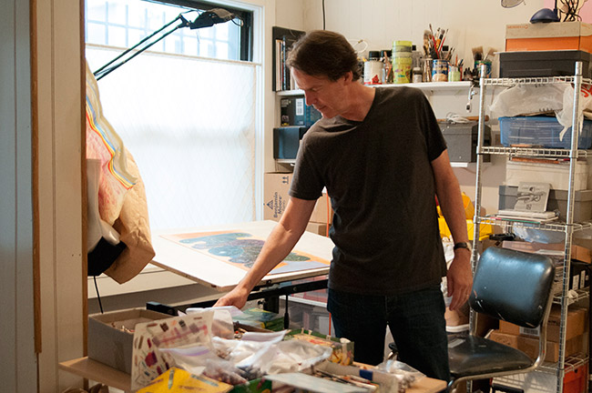
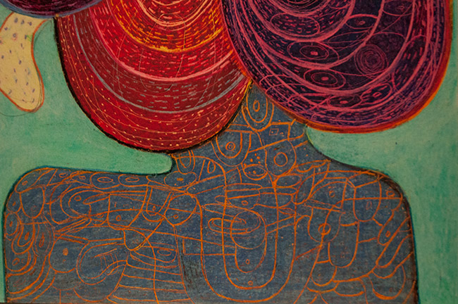
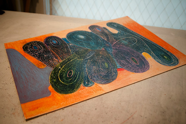
Richard’s studio is in the front room of his home where you must walk past several of his crayon drawings before you enter his private space. Working in both crayon and oil, Richard creates looping works that evoke the sense of a dividing cellular organism, tricking the eye as to what is the interior or exterior of each shape. Richard’s titles are often inspired by poems, the title exposing the interiority of his thought process during the work’s creation.
I\W: How did your work move from a more architectural focus to the head-like drawings and paintings you are working on now?
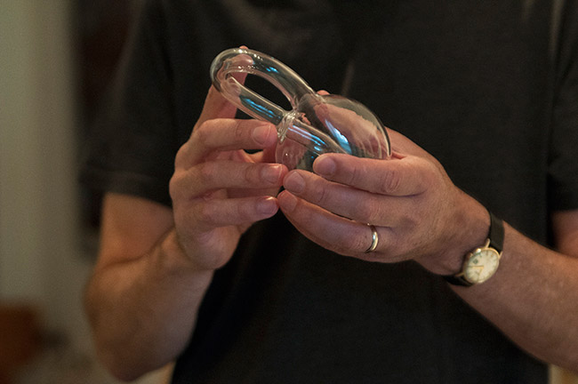
RH: The architectural stuff I haven’t done for a very long time. I went through a whole bunch of other things before getting here in the last 15 or 20 years. I know people think of that, but it has been so long. There have been a lot of things that have happened between then and now. The new paintings are manifested very differently, but the silhouette is almost the same. They grew out of a project I did with Ken Vandermark at the Cultural Center. Myself and Dan Grzeca, another artist, did the backdrop—an exquisite corpse. It was kind of ridiculous because it was 10 feet high and 25 feet long. It was this big thing we had to fold up. We decided to do a Trojan horse, and I got the tail. At the time I really liked making the tail because it seemed like a part of what I was doing in the past—making these interiors—but in a more concentric circle sort of way. That stuck in my mind for about five years, and I thought of them as horses’ tails and asses. I also thought of them as empty and full like Klein bottles, especially the ones that became these double ellipses. A friend who is a collector of mine was the one that turned me onto the Klein bottle. I like the idea of something being empty and then full. My pieces became almost like cityscapes to me, but more expansive—from a further distance. I wanted them to become more intimate again, so I started to think about heads and figures, and the shapes just sort of lent themselves to this idea of hair. I even use a comb sometimes to make the marks.
How different is the process of creating the paintings versus crayon drawings?
In some ways the crayon is a lot harder— or at least physically. Up until these I would take 2-3 months on a painting and one of these, because the paint has to be wet, I can do in a couple of days. There are some that I repaint of course, but it is basically one shot. I then decide what field the painting is going to sit on. I don’t change the background totally, but I make a lot of notes about what the color might be, and what the possibilities are. I did the paintings before I did the drawings. The paintings lead me to the drawings.
It seems like your newer drawings have sharper elements within the background than your earlier figure drawings. Is this a style you are transitioning into?
Those parts come in when I am stealing from myself from the past. The earlier paintings were all that architectural stuff, which I still am interested in returning to somehow, so I do it in the smaller interiors of the figures. That is one thing that I have always been interested in—this idea that you see something and it changes into something else before you can get fixed on it. I think that makes the experience of standing in front of something a little bit more active because your response is charged all the time, it’s not like you can just read it.
Your architectural paintings had characters that were hidden or masked, do you feel like your new pieces are giving more clues to your characters?
I don’t actually think of them as characters. I think of them as drawings, but I try to give them all a personality. It’s not a happy or sad or greedy personality, it’s not those type of things. They have a personality that is autonomous to the work, not outside in a way. That’s the way I see it. I imagine they could be read other ways, but as far as I am concerned it is really about the material and the experience of space. Also I like the idea that they are recognizable as heads. I was trying to make something that was more about the body and a thing. I never thought of myself as a real abstract painter. So when the work started to drift towards being less connected to the real world, when you couldn’t actually say what it was, that’s when I got a little unhappy about it. In my head when I make a painting that isn’t totally connected visually to the real world in a one to one way, I still read them as real. I have changed my artist statement because somehow I got forced to, but the only one I ever really wrote was, “Everything in these paintings are real.” I don’t know if that was ever good enough. I didn’t even mean it in a smart ass way, I was just trying to be succinct.
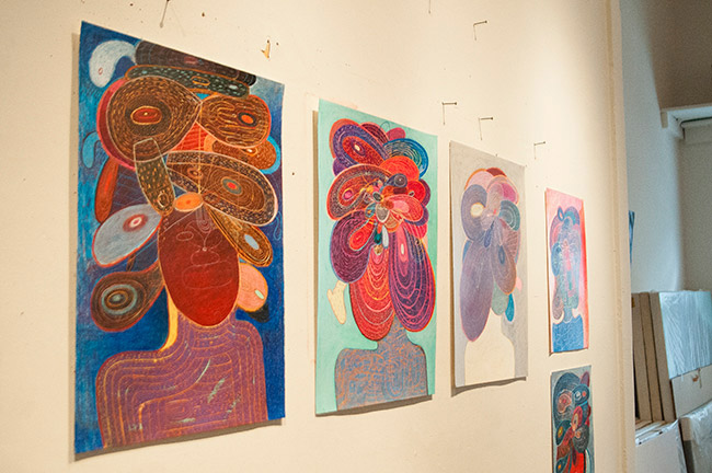
Your progression with the Klein bottle figure seems almost cellular, quickly doubling and quadrupling through your work. However they also look quite close to petals. Do you feel like they tend to have a floral quality to them?
I recognized that pretty much right away. For the first paintings of these, I always made the torso a sort of brown or wood color, so it could be something sitting on a table even though it was shaped with shoulders and a neck. The first group was all painted that way with a sienna color. The flower thing was definitely part of it, though it is not what I am thinking. I am open to people reading them different ways, but I know if I didn’t really want them to be flowers I would change them. It is my responsibility to change the image more than other people.
Are some of your recent paintings’ titles referencing an archetype for the figures involved?
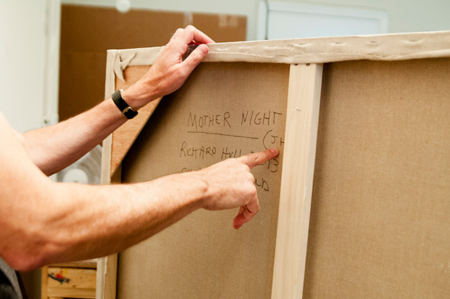
Yeah. Those are all from the titles of poems—I read a lot of poetry. The titles come later, but I always think that they are evocative of what I was thinking about, but not specifically. I know they are kind of mysterious. One of my newer ones is titled, “Mother Night,” which is a Jim Harrison poem. I always write the initials of the poet on the back of the painting so I can remember.
