Inside\Within is a constantly updating web archive devoted to physically exploring the creative spaces of Chicago's emerging and established artists.
Support for this project was provided by The Propeller Fund, a joint administrated grant from Threewalls and Gallery 400 at The University of Illinois at Chicago.

Search using the field below:
Or display posts from these tags:
3D printing 3D scanning 65 Grand 7/3 Split 8550 Ohio 96 ACRES A+D Gallery ACRE animation Art Institute of Chicago Arts Incubator Arts of Life audio blogging Brain Frame CAKE Carrie Secrist Gallery casting ceramics Chicago Artist Writers Chicago Artists Coalition Chicago Cultural Center Cleve Carney Art Gallery Clutch Gallery Cobalt Studio Coco River Fudge Street collage collection Columbia College Chicago Comfort Station comics conceptual art Contemporary Art Daily Corbett vs. Dempsey Creative Capital DCASE DePaul University design Devening Projects digital art Dock 6 Document drawing Duke University dye Elmhurst Art Museum EXPO Chicago Faber&Faber fashion fiber Field Museum film found objects GIF Graham Foundation graphic design Harold Washington College Hatch Hyde Park Art Center illustration Image File Press Imagists Important Projects ink installation International Museum of Surgical Science Iran Jane-Addams Hull House Museum jewelry Joan Flasch Artist's Book Collection Johalla Projects Julius Caesar Kavi Gupta Links Hall Lloyd Dobler LVL3 Mana Contemporary metalwork Millennium Park Minneapolis College of Art and Design Monique Meloche Museum of Contemporary Art Chicago (MCA) Museum of Contemporary Art Detroit (MOCAD) Museum of Contemporary Photography (MoCP) National Museum of Mexican Art (NMMA) National Resources Defense Council New Capital Northeastern Illinois University Northwestern University Ox-Bow painting paper mache Peanut Gallery peformance Peregrine Program performance photography PLHK poetry portraiture printmaking public art Public Collectors publications Renaissance Society risograph rituals Roman Susan Roots&Culture SAIC screen printing sculpture Sector 2337 Shane Campbell Silver Galleon Press Skowhegan Slow Smart Museum Soberscove Press social practice South of the Tracks Storefront SUB-MISSION Tan n' Loose Temporary Services Terrain Terrain Biennial text-based textile textiles The Banff Centre The Bindery Projects The Cultural Center The Franklin The Hills The Luminary The Packing Plant The Poetry Foundation The Poor Farm The School of the Art Institute of Chicago (SAIC) Threewalls Tracers Trinity College Trubble Club University of Chicago University of Illinois at Chicago (UIC) University of South Florida at Tampa Valerie Carberry Vermont Studio Center video weaving Western Exhibitions wood carving woodwork Yellow Book Yollocalli Arts Reach zinesInside\Within is produced in Chicago, IL.
Get in touch:
contactinsidewithin@gmail.com
Robert Burnier's System-Driven Folds
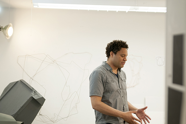
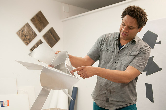
Robert creates work that forces him through a journey of material, physically recreating images originally formed on the computer with aluminum. Working with and against the strict form, Robert creates objects with emphasis on the fold, a sculptural map of his physical process.
I\W: What inspired you to change directions from focusing on computer science to an art practice?
RB: Before I even got into computer science, I taught myself programming. Systems were pretty simple then, they were fun and I thought of them as a material like any other kind. I would make a lot of my own games, and that fascination and attraction to making these things that have their own life, a system that exists inside themselves, carried me through school. I guess I have always kind of had a tendency to think systematically about things, so after doing computers for awhile I became distant from ideas I cared about. A lot of the programs were just for insurance, so I asked myself what I was doing, and I reevaluated. A friend and I were talking about what could you do that involves objects, making, your hands, mind, and theory all at once. Art is one of those things for me, so it was not such an unnatural switch as one might think. It got me back to the fascination with making and objects.
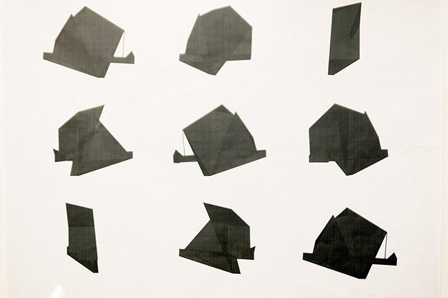
Are CAD, or computer systems the basis for any work that you produce?
It all starts from a computer, or gets translated through it. The physical and the virtual are constantly in conversation with each other. Whether it is going in one direction or the other, they transform each other in these ways. My stance towards it all is to feel that of course I am the impetus to all of this and there is a definite part that I bring to it, but also this idea of not working with the material, but working against its push back. There are two things pushing back at me. One is the structure that was in the CAD system, and the other thing is the material. I can only bend it so much. In a computer you can make planes go through each other, which I have done usually in the process of setting up something, but you can’t do that physically. You have to find another route, you have to walk around a different way. Once you have completed something physically, you can’t really back up. It ends up being this record of a walkthrough or an action, but within a very defined universe.
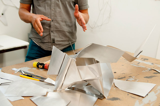
Are any of your maneuvers spontaneous? Or are they all calculated folds relating back to the image you created digitally?
There is definitely a spontaneity. There are things that I will do, but it still retains that limitation. The things that are there express themselves no matter what. I don’t think the actions are ever fully spontaneous, they are always complicated somehow. Sometimes there really is no other choice than a specific fold, but sometimes things are going a particular direction and I can completely flip it around and go a different way. I have taken the same structure and done it more than once, and it is completely different each time. There is one that I did that came out really rectilinear and the second time I did it, it was this playful splayed-out figure. If I make just one choice differently, even with the same exact pattern, the piece ends up having a different life.
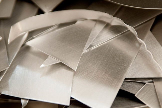
How do you create the final matte color seen on your folded objects?
They are mostly aluminum, but I have used foam and other materials in some of the other sculptures. I went through a period of trials. Some of the color I tried was directed by the shape, so I would try to get it to spray through the shape and create a pattern. A lot of those didn’t turn out very satisfying. What I settled on was monochrome because I wasn’t going to do color unless it had something to do with what happened, the physicality of what was happening. The color turned out so not particular and unspecific that I stuck with it because it says nothing, although some people say it kind of looks military or institutional.
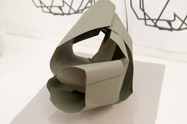
Are you camouflaging the color to direct the eye to the shape and folds of the objects?
That’s funny because one of the other choices for paint I had was the camouflage colors. You can buy them as a set. You paint the whole object tan, and then you have these two different colors that you spray on top. I did actually use that for some other pieces that worked pretty well too.
This neutral color palette stays very consistent with your objects until you get to your layered inkjet print “Dutch Wax.” What was the reasoning to have such bright colors for that piece?
I really like that piece, there is going to be more with that at some point. The non-specificity of the color of my objects is good for the shape. The more I can push it into that space of ambiguity, the better. The different colors have their own meaning, patterns. I called it Dutch Wax because one of the patterns was the Dutch wax pattern, and Dutch wax is interesting because it is something that is commonly worn by people of African descent, at least in this age that we live in. Dutch wax gets its name from the fact that it was made by Dutch industry, but they didn’t invent it, they got it from Indonesia. It has this really mixed up history, where it is not as clear as one might think. Even though people identify it as African, it is lifted out of that. I liked using that for that reason, and the other color was this hot pink. It was a question of gender, also a modern color. That particular piece is two prints that are layered. I printed the two of them, and then the sheets were thin. The piece has this mysterious depth that you can’t quite pick out.
Do you feel like you could create an algorithm to how you produce work currently in your practice?
No, there are not steps. I have never repeated anything exactly. Even when I was actually developing software, I noticed that no matter what I did, people would find workarounds. We used to joke about it saying that the system would work great if it wasn’t for the users. It is kind of funny to computer programmers, but it is actually kind of insidious in a way. I am not trying to create something that generates art, for me that would be really boring, or it is exactly what I am working against. I see a lot of art that is generated by a computer and looks kind of organic because it is flowing on the screen or moving or animating. That can be described by a formula, it just doesn’t interest me. I am more interested in this division between culture and the physical.
Many of your titles have number associations with them, what do those numbers refer to?
I went through a shift. I started out naming my work after something that happened while making them. Then I started making different kinds of objects that I wanted to place in the same show, so I thought I would number them instead. I quickly got disaffected. I know what I was going for, but now I am naming them in a similar way as before, but they are in Esperanto. It’s this universal language that borrows from very particular words and languages like Latin and Spanish and Germanic. It is a fascinating failure of a language for me, but it is perfect because it gives a specificity to the title. It seems like a name, it seems like a word, but it is not readily available. It takes a step. I think it is a good metaphor. I like it to bring you a step so you can do something with what you are seeing, and not just be instantly turned away or confused. There is a little bit of give.


