Inside\Within is a constantly updating web archive devoted to physically exploring the creative spaces of Chicago's emerging and established artists.
Support for this project was provided by The Propeller Fund, a joint administrated grant from Threewalls and Gallery 400 at The University of Illinois at Chicago.

Search using the field below:
Or display posts from these tags:
3D printing 3D scanning 65 Grand 7/3 Split 8550 Ohio 96 ACRES A+D Gallery ACRE animation Art Institute of Chicago Arts Incubator Arts of Life audio blogging Brain Frame CAKE Carrie Secrist Gallery casting ceramics Chicago Artist Writers Chicago Artists Coalition Chicago Cultural Center Cleve Carney Art Gallery Clutch Gallery Cobalt Studio Coco River Fudge Street collage collection Columbia College Chicago Comfort Station comics conceptual art Contemporary Art Daily Corbett vs. Dempsey Creative Capital DCASE DePaul University design Devening Projects digital art Dock 6 Document drawing Duke University dye Elmhurst Art Museum EXPO Chicago Faber&Faber fashion fiber Field Museum film found objects GIF Graham Foundation graphic design Harold Washington College Hatch Hyde Park Art Center illustration Image File Press Imagists Important Projects ink installation International Museum of Surgical Science Iran Jane-Addams Hull House Museum jewelry Joan Flasch Artist's Book Collection Johalla Projects Julius Caesar Kavi Gupta Links Hall Lloyd Dobler LVL3 Mana Contemporary metalwork Millennium Park Minneapolis College of Art and Design Monique Meloche Museum of Contemporary Art Chicago (MCA) Museum of Contemporary Art Detroit (MOCAD) Museum of Contemporary Photography (MoCP) National Museum of Mexican Art (NMMA) National Resources Defense Council New Capital Northeastern Illinois University Northwestern University Ox-Bow painting paper mache Peanut Gallery peformance Peregrine Program performance photography PLHK poetry portraiture printmaking public art Public Collectors publications Renaissance Society risograph rituals Roman Susan Roots&Culture SAIC screen printing sculpture Sector 2337 Shane Campbell Silver Galleon Press Skowhegan Slow Smart Museum Soberscove Press social practice South of the Tracks Storefront SUB-MISSION Tan n' Loose Temporary Services Terrain Terrain Biennial text-based textile textiles The Banff Centre The Bindery Projects The Cultural Center The Franklin The Hills The Luminary The Packing Plant The Poetry Foundation The Poor Farm The School of the Art Institute of Chicago (SAIC) Threewalls Tracers Trinity College Trubble Club University of Chicago University of Illinois at Chicago (UIC) University of South Florida at Tampa Valerie Carberry Vermont Studio Center video weaving Western Exhibitions wood carving woodwork Yellow Book Yollocalli Arts Reach zinesInside\Within is produced in Chicago, IL.
Get in touch:
contactinsidewithin@gmail.com
Tony Lewis's Epigrammatic Abstractions
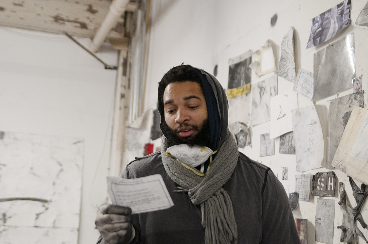
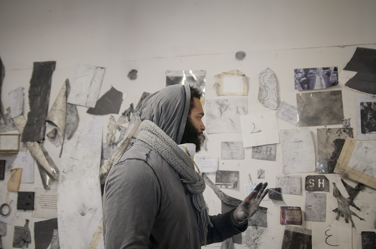
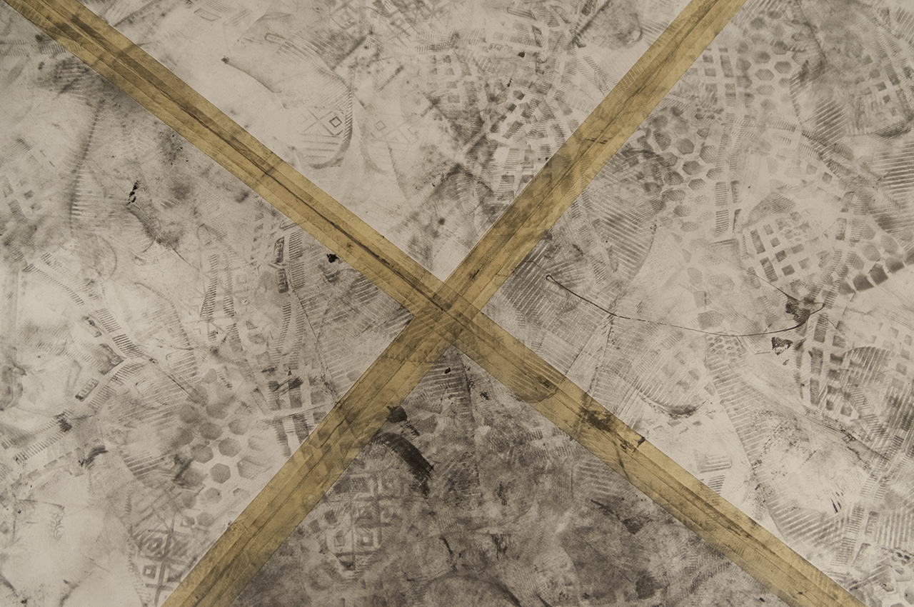
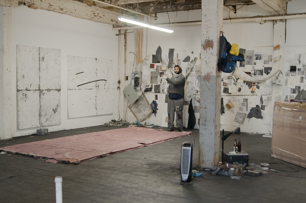
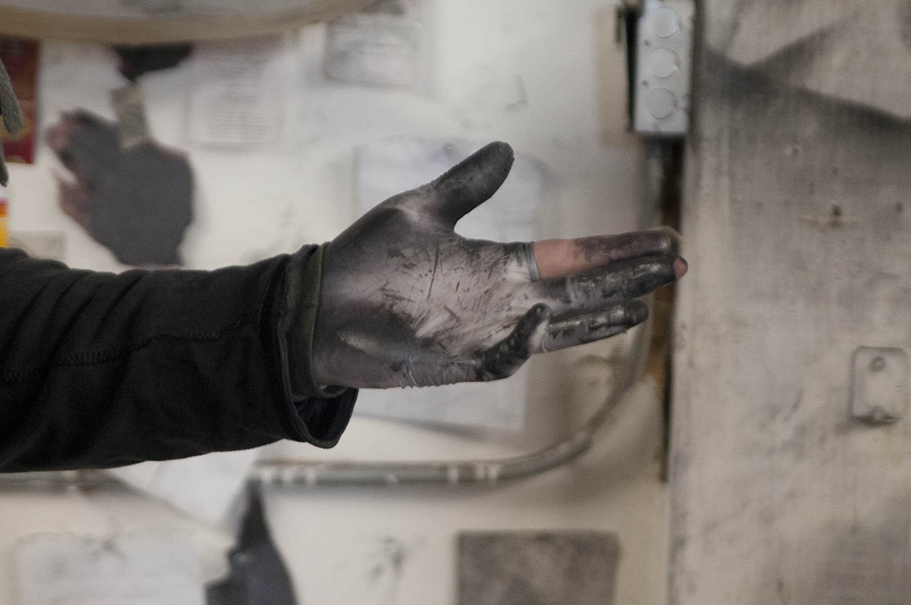
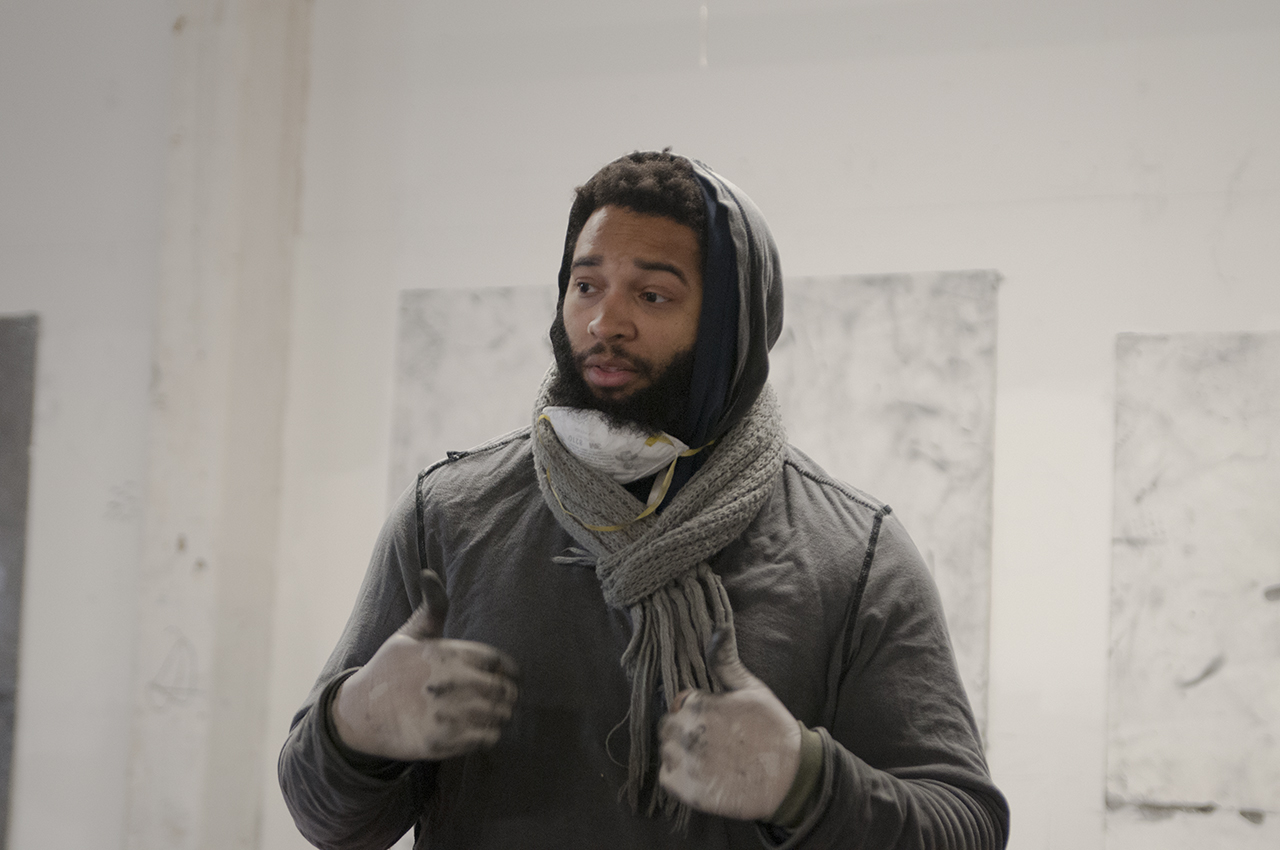
Layers of graphite shavings create an opaque yet luminous film across the entirety of Tony’s studio, steadily imprinting the drawings that exist both on the walls and floor. Working mainly with appropriated language, Tony is interested in turning the nonsense from his many sources into important material and vice versa, reconstructing the text into marks and meaning of his own.
I\W: How did Life’s Little Instruction Book come to serve as an inspiration for so many of your drawings?
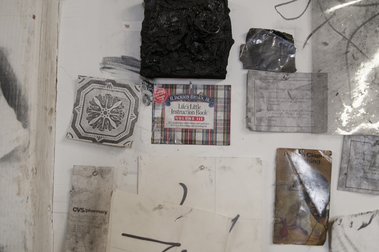
TL: I’ve worked with LLIB for maybe five years, and I have four different drawings that stem from it. I tend to do that with different source material, but I think Life’s Little Instruction Book was probably the first opportunity to deal with appropriated language and visual structures. Many of the passages are really clichéd and painfully mundane, but true. Being able to use it as a source to make work allows me to have some sort of distance from it. It’s satire, but there is also a belief in the words. This initial tension is where the project begins, and then drawings can go other places. Although LLIB has been published in 35 different languages, and was a New York Times best seller, the book makes several references to a certain type of traditional American life, which I think is ironically myopic to its audience. It’s imbedded with this common sense approach to living. Written by H. Jackson Brown, Jr., it was initially a book he gave to his son before he went off to college. A few examples of entries are:
152 · Fly Old Glory on the Fourth of July.
366 · Don’t flush urinals with your hand—use your elbow.
The latter is presumably good advice, but you can tell who it’s aimed for.
There is a lot of pertinent language and then a lot of nonsense. I’m interested in taking what is nonsense and making that important, and then taking the thing that’s most important and maybe turning that into nonsense somehow. I think there is a chance to play with thought-terminating clichés.
What is your perspective of the passage “Keep a tight rein on your temper,” a drawing you produced at The Bindery Projects in 2013?
I think it’s something that most people need to be reminded of, but I’m also weary of it as someone who has been predetermined as an overly aggressive black man with a short fuse—a thought-terminating cliché. I’ve been forewarned countlessly not to show anger, especially against various forms of authority. That statement, and its implications are paramount to understanding the foundations of the drawing project.
How did the installation of the passage (with tight rubber bands and nails) reflect its meaning?
The installation is labor intensive, and I think for that type of drawing and that particular language it worked well together. It’s great to have LLIB as a foundation conceptually and formally. I think it’s great when I can create that literal tension with the work, and with the space surrounding the work, and surrounding the people looking at the work. It can be an effective way to make a drawing, especially using LLIB, nails, and rubber bands. It’s a technique I came across in the studio when I was in school. It takes one copy of LLIB, a level, ruler, and pencil- scholastic materials. After eye-balling the scale, a simple grid is put in place, then depending on how long the drawing is, 1,000 to 3,000 nail are hammered across the wall. Rubber bands, which are covered in graphite powder, are stretched around the nails.
How do you navigate the ease of your material’s ability to transfer (the loose graphite powder) against the relative opaqueness of the content within your text drawings on paper?
I think that is what I like most about the work. Most drawings are difficult for me conceptually, and they have been since the beginning. I have written about the work and have talked about the work and have exhausted almost every different way of approaching it to either coincide or go against the formal qualities. I haven’t excavated everything, but I have uncovered quite a lot over the course of three years. It feels like at this point I can’t separate the conceptual content from the formal content. I can’t really separate the original language from the size of the paper. I tend to make drawings on paper that I usually attribute a particular project to a particular size. These are vertically oriented 5’x7’ sheets of paper— I won’t use this size of paper for anything else. Sometimes it’s important to have physical restrictions to move forward.
What is the template for each of these text drawings? What is the persistent starting point?
(INSIDE/WITHIN was shown the template inside the artist’s studio)
Danny Giles said something about these drawings when we did a critique together, I’m paraphrasing, “…You receive the information, you kind of see the potential for things to be said, but leave with nothing…” I thought that was as wonderful thing and a horrible thing. It’s true in terms of the way the work is set up. There is a template drawing that is not particularly a drawing, but it’s what I use to make the work. I use it to make every drawing that has come after it in this project.
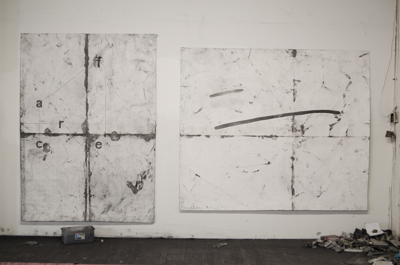
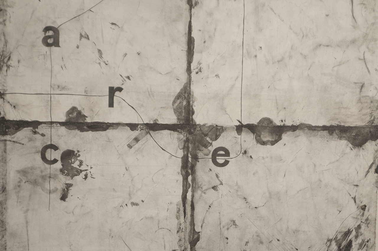
Diagrammatically, mechanically, this is the format. There is a sentence, which provides the structure and if I use, let’s say, the letter ‘c’ from it, it will always be in the exact same position on the drawing. It is never going to shift positions when it’s selected to be in a new drawing. Each work is made from this tight grid of language. It is a grammatically correct compound sentence, it is capitalized at the beginning, it has a comma, it has a period— it just doesn’t carry any clear meaning. It does carry historically important terms like “people of color” and “colored people”—and I think using that as a epigrammatic foundation is a viable place to begin making a drawing.
Why do you choose to decide where the audience’s eyes should flow within your text drawings instead of allowing the audience to read the text at will?
I like to be able to change the direction that language is traditionally read, without that line it’s just floating letters. For the first five drawings I think that’s what I was doing. It was too much of a scatter plot—without subtle direction. When you provide direction, I think people will either take your direction, or be inclined to find new pathways. The line, among other things, is a way to provide a subtle direction to be reacted to.
To entertain the importance of words, let’s use this as an example. A drawing could read ‘f-a-r-c-e’ left-to-right, up-to-down. If someone wants to read ‘farce’ they will read ‘farce’, but if somebody wants to start at that ‘c’ and follow the line to go to the ‘a’ and then double f, ‘e’, ‘r’ they get to the word ‘caffer’. Then they also can read that backwards as ‘reffac’. The first two are words. ‘Refac’ is a non-word and, when it comes to those three things as ideas in relationship to the original linguistic structure, I hope it’s a viable convergence to access the space of the drawing. The apprehension to use words or graphemes in art making is a fair one I think, as the language in the drawings are not entirely the subject. Primarily, it’s the field in which these relationships are made, in relation to the formal emptiness. It’s how rough these drawings are treated, in relation to humor, time, and so on. Motivation has shifted so many times from the support of the language; negation of the language; satire of the language, and then have nothing to do with it—really just focusing on making the line.
Can you explain the transition to your newer drawings that just highlight a gesture?
Those are relatively newer works I have been working on since last summer. It’s based off of Gregg shorthand, which is stenography. I think it’s a step forward from the text drawings because it’s a chance quite honestly to expand my dictionary, and access a broader discussion of figure/ground within a canonized history of cosmic, pure abstraction, while pledging the work to language system of diagrammatic abstraction—drawings that become formally looser, and at the same time conceptually more specific, hopefully. In the previous text drawings I think there is a tension between the line and the letter. There is this weirdness where your eyes may want one or the other, but to see a strikethrough or to see this weak line that is drawn through a seemingly printed grapheme is the crux of the drawing occasionally. It works well in the previous drawings. But it gets to the point where such a weak line has to contradict and compete with the word, and when talking about the work, the sentence becomes the most crucial thing because of the ubiquity of letters. I want to get to a point where I’m formally more free, and there is less tension between the line and the language, but I still hold onto the meaning and sound of the letter “p” for example—they become the same thing—the line is the language. I have been teaching myself Gregg shorthand for the last year and it’s basically like learning a new language. Right now I’m at a place where each drawing is a word, each word is a potential drawing, and I’m using colloquial structures to organize them. There’s a looseness in drawing something that is handwritten, yet appropriated—similar to owning a joke. There is something about that fact that pushes it back from appropriated systems, to a field of micro-decisions on the surface of the paper.
