Inside\Within is a constantly updating web archive devoted to physically exploring the creative spaces of Chicago's emerging and established artists.
Support for this project was provided by The Propeller Fund, a joint administrated grant from Threewalls and Gallery 400 at The University of Illinois at Chicago.

Search using the field below:
Or display posts from these tags:
3D printing 3D scanning 65 Grand 7/3 Split 8550 Ohio 96 ACRES A+D Gallery ACRE animation Art Institute of Chicago Arts Incubator Arts of Life audio blogging Brain Frame CAKE Carrie Secrist Gallery casting ceramics Chicago Artist Writers Chicago Artists Coalition Chicago Cultural Center Cleve Carney Art Gallery Clutch Gallery Cobalt Studio Coco River Fudge Street collage collection Columbia College Chicago Comfort Station comics conceptual art Contemporary Art Daily Corbett vs. Dempsey Creative Capital DCASE DePaul University design Devening Projects digital art Dock 6 Document drawing Duke University dye Elmhurst Art Museum EXPO Chicago Faber&Faber fashion fiber Field Museum film found objects GIF Graham Foundation graphic design Harold Washington College Hatch Hyde Park Art Center illustration Image File Press Imagists Important Projects ink installation International Museum of Surgical Science Iran Jane-Addams Hull House Museum jewelry Joan Flasch Artist's Book Collection Johalla Projects Julius Caesar Kavi Gupta Links Hall Lloyd Dobler LVL3 Mana Contemporary metalwork Millennium Park Minneapolis College of Art and Design Monique Meloche Museum of Contemporary Art Chicago (MCA) Museum of Contemporary Art Detroit (MOCAD) Museum of Contemporary Photography (MoCP) National Museum of Mexican Art (NMMA) National Resources Defense Council New Capital Northeastern Illinois University Northwestern University Ox-Bow painting paper mache Peanut Gallery peformance Peregrine Program performance photography PLHK poetry portraiture printmaking public art Public Collectors publications Renaissance Society risograph rituals Roman Susan Roots&Culture SAIC screen printing sculpture Sector 2337 Shane Campbell Silver Galleon Press Skowhegan Slow Smart Museum Soberscove Press social practice South of the Tracks Storefront SUB-MISSION Tan n' Loose Temporary Services Terrain Terrain Biennial text-based textile textiles The Banff Centre The Bindery Projects The Cultural Center The Franklin The Hills The Luminary The Packing Plant The Poetry Foundation The Poor Farm The School of the Art Institute of Chicago (SAIC) Threewalls Tracers Trinity College Trubble Club University of Chicago University of Illinois at Chicago (UIC) University of South Florida at Tampa Valerie Carberry Vermont Studio Center video weaving Western Exhibitions wood carving woodwork Yellow Book Yollocalli Arts Reach zinesInside\Within is produced in Chicago, IL.
Get in touch:
contactinsidewithin@gmail.com
Josh Reames's Compositional Illusions and Palm Trees
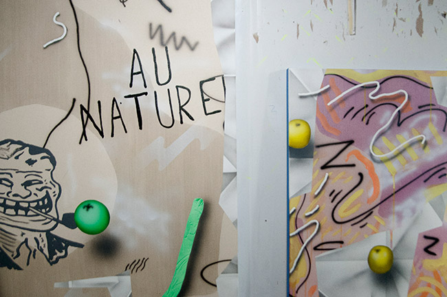
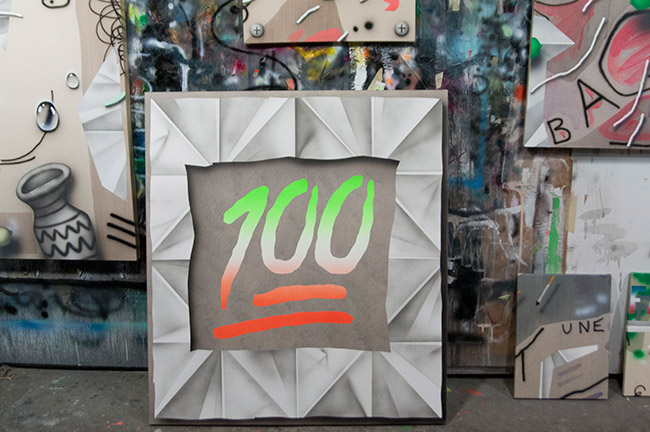
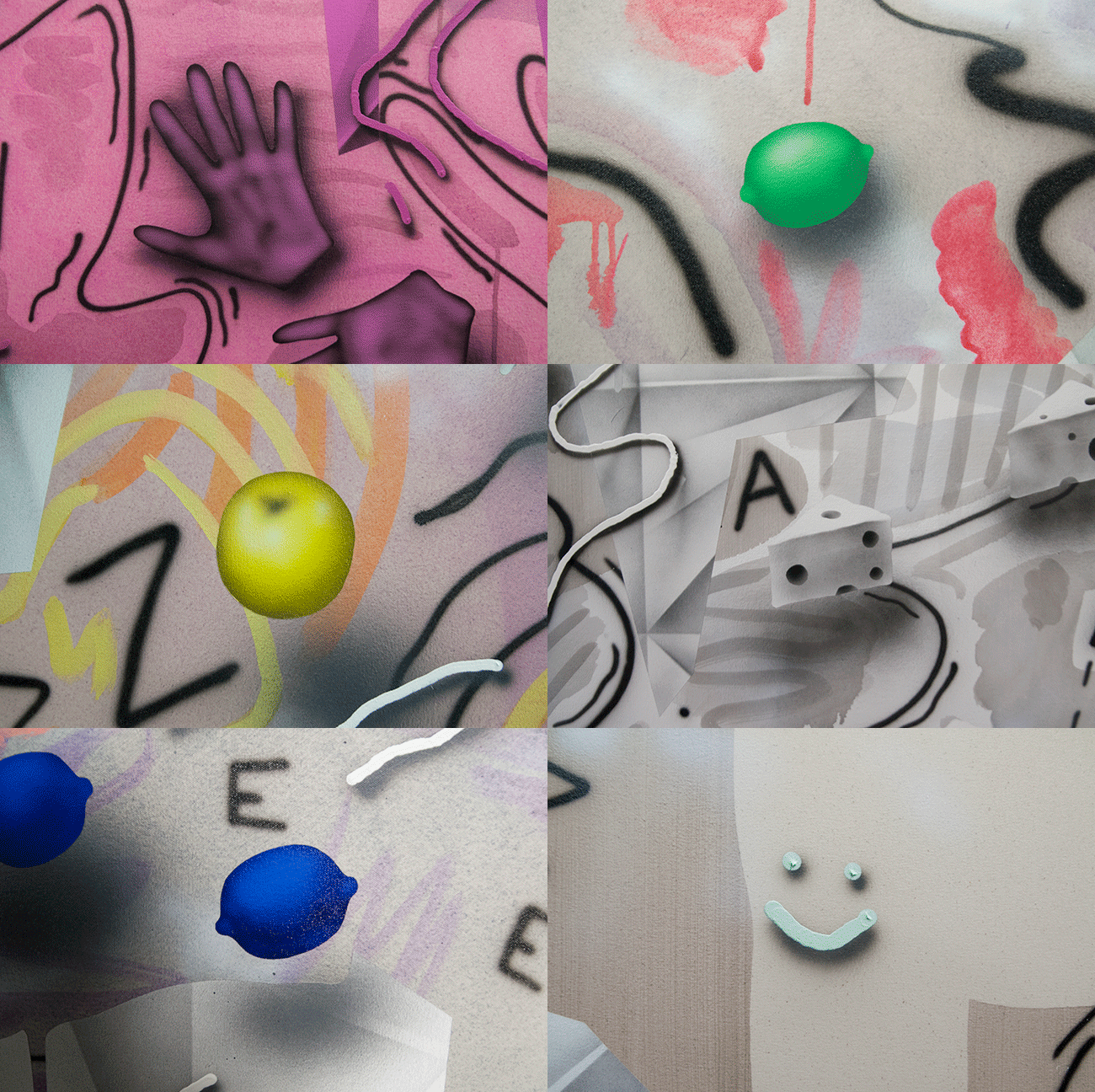
Previously focusing on the subject of escapism, Josh has recently moved away from escapist imagery, instead focusing on the removal of hierarchy from his compositions. Josh creates the illusion of depth within his work by heavily incorporating textured paper and shadowed objects, such as emojis. By placing the modern day hieroglyphics into his painted works, Josh creates a universal language of objects that exudes a dry sense of humor.
I\W: Can you tell me a little bit about how you create depth within your flat canvases?
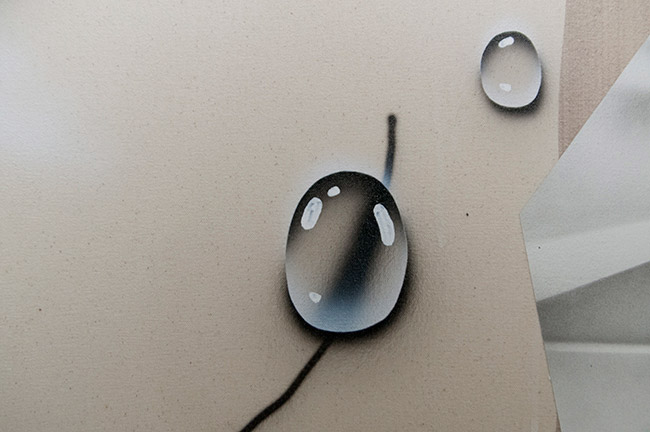
JR: I come from a printmaking background, so the way that I approach space is through illusion and super flat surfaces. Being trained in painting is more about modeling something, or building a painting up background to foreground. For me it’s kind of like putting a bunch of photographs on a table and spreading them around. It’s very flat, but also the photographs have depth within the image. That’s kind of the way I think about it—the background is very flat, the airbrush line work is very flat, but then the paper and objects give the illusion of depth. Also, the objects are modeled somewhat realistically and some of them have drop shadows to make them pop off of the surface. At most the space looks maybe six inches deep; I like that shallow depth of field, but definite dimension/space.
Would you consider your works painted collages?
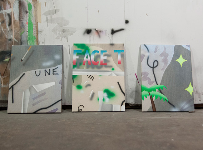
Yeah, totally, in the way a collage is formally arranged. I think of them as objects, marks, and all of these different elements being composed; and ideally they are composed in a way in which they have the impression that the edge of the canvas could continue on and on. They could be infinite paintings, but you are seeing a cropped section. I have had a really, really hard time making little paintings because I think it is hard to compress information into a painting. Yesterday I stretched a few that were just cut from larger unstretched paintings; I took a small frame and moved it around until I found an interesting composition and then cut it out and stretched it. It seems appropriate.
If you were to intentionally produce a smaller piece would you shrink the size of the objects as well?
I have tried making lots of smaller paintings and they end up looking forced because there is no space for the objects to breathe. I don’t really like the idea of shrinking marks and images to fit into a small frame. For some reason that seems wrong to me. If the scale of marks stays the same no matter what size painting you work on, then there is more continuity conceptually. Instead, it makes more sense to make a cropping of a larger image if I need to make little paintings.
Is there a focal point you tend to always revert back to for your drop shadows?
The light is always on the top left, every time. I don’t know why I chose that direction. Maybe because I am left-handed.
Do you always utilize paper in your paintings?
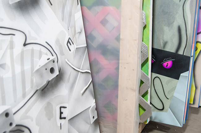
Not always, but most of the time. It’s like the grid. It’s structure, it’s something concrete in these paintings where everything is floating around. Even the background being raw canvas seems kind of like a non-surface to me. I keep thinking about the paper as a moment of structure.
Is that method going back to your printmaking background and the sense of being more comfortable with paper?
I have never been comfortable with real paper. It kind of came from this installation idea I did where I took a huge sheet of brown paper and folded it all down to this foot and a half wide paper football and opened back up and put it on the wall. I was really into it.
What brought you to utilize emojis, and how are you making them your own style within your paintings?
I started thinking about them in terms of pictorial language—modern day hieroglyphics, and also thinking about it as this totally ubiquitous language. You could have emoji conversations with people who don’t speak English. That’s also how I choose the objects in my paintings, I want them to be very nonspecific and non-branded: lemons or hammers or vases or cheeses. They are totally recognizable, but nonspecific. I think once you start to use really specific logos and imagery it becomes about product(s), and that’s not what I want it to be about.
Does that play into you not wanting a hierarchy in your compositions?
Yeah, I got really into the idea of relativity. Spacial relativity, moral relativity, and relativity within the art world. There is no real hierarchy with types of art anymore. Now it is all about where you are standing or which circle of influence you are in—nothing like the kind of Greenbergian ultimates that used to exist. On a more micro-level, thats the way I think about imagery and the relationships between marks on a canvas.
What is the purpose of the objects and installations you create in your shows in relation to your paintings?
I think they mimic the paintings. They are these compositions of disparate objects like crutches with a real baguette and fake lemon slices on the tip of it. I don’t make sculptures in the studio. I can’t think about sculpture in the studio. Studio is painting, painting, painting while exhibitions are more about the whole—problem solving with space.
Do you intentionally address humor in your work?
That is something I am very interested in. I prefer things to have a level of humor, even if it is dry humor or a kind of humor that you can’t quite put your finger on. There might not be a joke, it is not academic, but there is something kind of funny about it.
Can you explain the escapism aspect of your work?
That aspect has definitely become less prominent. Previously, I was using a lot of tropical imagery and cruise/vacation imagery. It was all about escapism and this idealism/reality dialectic. You know, you have this Corona commercial idea of the perfect beach hang out spot and while white sandy beaches area really wonderful and great, but you also get sand in your shorts and sunburn and there are sand fleas—a disconnect between the ideal version of the thing and the actual version. In a way it is kind of similar to painting. Not being trained as a painter there is always a way I envisioned a painting to look, and then how it actually turned out. There is always that slippage in there. It becomes weird when painting is what you do full time. It doesn’t feel like escapism, but it totally has some of the qualities of escapism. The amount of time I spend in my studio is more than a 9-to-5, and there is a lot of struggle involved; a lot of trial and error and frustration, but it also has the victory moments!
